Cluster Analysis
Introduction
Cluster analysis includes two classes of techniques designed to find groups of similar items within a data set. Partitioning methods divide the data set into a number of groups pre-designated by the user. Hierarchical cluster methods produce a hierarchy of clusters, ranging from small clusters of very similar items to larger clusters of increasingly dissimilar items. This lecture will focus on hierarchical methods.
Partitioning methods are best applied when a specific number of clusters in the data are hypothesized, such as morphological data on specimens for a given number of species. One of the most well-known partitioning methods is k-means clustering, which partitions n samples into k clusters. K-means clustering tends to produce clusters of equal size, which may not be desirable in some situations.
Hierarchical methods produce a graph known as a dendrogram or tree that shows the hierarchical clustering structure. Some hierarchical methods are divisive in that they progressively divide the one large cluster that contains all of the samples into pairs of smaller clusters, repeating this process until all clusters have been divided into individual samples. Other hierarchical methods are agglomerative and do the opposite: they start with individual samples and form a cluster of the most similar samples, progressively joining samples and clusters until all samples have been joined into a single large cluster.
Hierarchical methods are useful because they are not limited to a pre-determined number of clusters and can display the similarity of samples across a wide range of scales. Agglomerative hierarchical methods are common in the natural sciences.
Computation
The data matrix for cluster analysis needs to be in standard form, with n rows of samples and p columns of variables, called an n x p matrix. Hierarchical agglomerative cluster analysis begins by calculating a matrix of distances among all pairs of samples. This is known as a Q-mode analysis; it is also possible to run an R-mode analysis, which calculates distances (similarities) among all pairs of variables. In a Q-mode analysis, the distance matrix is a square, symmetric matrix of size n x n that expresses all possible pairwise distances among samples. In an R-model analysis, the matrix has size p x p and expresses all possible pairwise distances (or similarities) among the variables. The remainder of these notes will focus on Q-mode analysis, that is, clustering of samples.
Before clustering has begun, each sample is considered a cluster, albeit a cluster containing a single sample. Clustering begins by finding the two clusters that are most similar, based on the distance matrix, and merging them into a new, larger cluster. The characteristics of this new cluster are based on a combination of all the samples in that cluster. This procedure of combining two clusters and recalculating the characteristics of the new cluster is repeated until all samples have been joined into a single large cluster.
Various distance metrics can be used to calculate similarity, and different types of data require different similarity coefficients. Euclidean distance is a useful and common distance measure for data with linear relationships. For data that show modal relationships, such as ecological data, the Sørenson distance (also called Bray or Bray-Curtis) is a better descriptor of similarity because it is based only on taxa that occur in at least one sample and it ignores the often large numbers of taxa that occur in neither sample.
The linkage methods control the order in which clusters are joined, and various linkage methods are available. Thenearest-neighbor or single-linkage method is based on the elements of two clusters that are most similar, whereas the farthest-neighbor or complete-linkage method is based on the elements that are most dissimilar. These methods are based on the outliers within clusters, which is often undesirable. The median, group average, and centroid methods all emphasize the central tendency of clusters and are less sensitive to outliers. Group average may be unweighted (also known as UPGMA, or unweighted pair-group method with arithmetic averaging) or weighted (WPGMA, or weighted pair-group method with arithmetic averaging). Ward’s method method joins clusters based on minimizing the within-group sum of squares and tends to produce compact, well-defined clusters.
Interpretation of Dendrograms
The cluster analysis results are shown by a dendrogram, which lists all of the samples and indicates at what level of similarity any two clusters were joined. The x-axis measures the similarity or distance at which clusters join, and different programs use different measures on this axis.
In the dendrogram shown below, samples 1 and 2 are the most similar and join to form the first cluster (with a similarity or height of 5), followed by samples 3 and 4. The last two clusters to form are 1–2-3–4 and 5–9-6–7-8–10. In some cases, clusters grow by joining two smaller clusters, such as 1–2 and 3–4. In other cases, clusters grow by adding single samples, such as the join of 6 with 5–9, followed by the join of 7. The growth of a cluster by the repeated addition of single samples is called chaining.
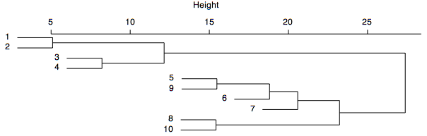
A common goal is to determine the number of groups that are present in the data, and it should be clear from the hierarchical nature of a dendrogram that the number of clusters depends on the desired level of similarity. Often, one searches for natural groupings that are defined by long stems, such as the long stem extending to the right of the cluster 1–2-3–4. Some have suggested that all clusters should be defined at a consistent level of similarity, such that one would draw a line across the dendrogram at a chosen level of similarity, and all stems that intersect that line would indicate a cluster. The strength of clustering is indicated by the level of similarity at which elements join a cluster. In the example above, elements 1–2-3–4 join at similar levels, as do elements 5–9-6–7-8–10, suggesting the presence of two major clusters in this analysis.
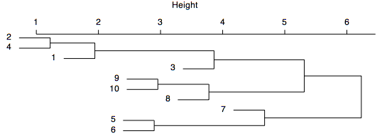
The dendrogram shown below displays more chaining, clustering at a wider variety of levels, and a lack of long stems, suggesting that there are no well-defined clusters within the data. Defining groups reflects a tradeoff between the number of groups and the similarity of elements in the group. If many groups are defined, each will have only a few samples, and those samples will be highly similar to one another, but analyzing so many groups may be complicated. If only a few groups are defined, the clusters will likely have many samples with a lower level of similarity, but having fewer groups may make subsequent analysis more tractable.

Dendrograms are like mobiles: they can be freely rotated around any stem. For example, the dendrogram shown above could be spun to place the samples in a different order, as shown below. Spinning a dendrogram is a useful way to accentuate chaining patterns or clusters' distinctiveness (although it does not help in this case). For many cluster analysis programs, spinning must be done separately and tediously in a graphics program, such as Illustrator. Spinning can be done much more directly in R.
Considerations
Because of its agglomerative nature, clusters are sensitive to the order in which samples join. It is possible that clusters may not reflect the actual groups in the data very well.
Cluster analysis is also sensitive to the chosen distance metric and linkage method. Because of this, novices may be tempted to try many combinations of distance metric and linkage methods in the hope that the right combination will emerge. Instead, such a shotgun approach usually results in a bewildering array of conflicting results. Choosing a distance metric and linkage method should always be based on carefully considering the data and the analysis goals.
Caution should be used when defining groups based on cluster analysis, particularly if long stems are absent. Even if the data form a cloud in multivariate space, cluster analysis will still form clusters, which may not represent natural or meaningful groups. It is generally wise to compare a cluster analysis to an ordination to evaluate the distinctness of the groups in a multivariate space.
Transformations may be needed to put samples and variables on comparable scales; otherwise, clustering may reflect sample size or be dominated by variables with large values. For example, ecological count data are commonly percent-transformed within rows to remove the effect of sample size. For ecological data and other data, it is common to perform a percent-maximum transformation within columns to prevent a single large variable from overwhelming important variations in numerically small variables.
Cluster Analysis in R
The cluster package in R includes the many methods presented by Kaufman and Rousseeuw (1990). Curiously, the methods all have the names of women that are derived from the names of the methods themselves. Of the partitioning methods, pam() is based on partitioning around mediods, clara() is for clustering large applications, and fanny() uses fuzzy analysis clustering. Of the hierarchical methods, agnes() uses agglomerative nesting, diana() is based on divisive analysis, and mona() is based on monotheistic analysis of binary variables. Other functions include daisy(), which calculates dissimilarity matrices but is limited to Euclidean and Manhattan distance measures.
This example will show how to apply cluster analysis to ecological data to identify groups of collections that have similar sets of species in similar proportions. The data consists of counts of 38 taxa in 127 samples of marine fossils from the Late Ordovician of the Cincinnati, Ohio region. Notice that most values are zero: samples typically contain only a few taxa, although many different taxa are present in the entire data set.
fossils <- read.table(file="c2.txt", header=TRUE, row.names=1, sep=",") head(fossils)
Because this data is based on counts of fossils where the number of specimens differs greatly among the samples (the smallest sample has 15 specimens and the largest has 295), we want the cluster analysis to reflect differences in the relative proportions of species, not sample size, so all abundances should be converted to percentages. To do this, we perform a percent transformation on rows, sometimes called standardization by totals. In addition, some taxa are very abundant, and others are rare. Rather than have the cluster analysis dominated by the most abundant taxa, we follow the percent transformation with a percent maximum transformation on the columns. The latter converts every value to a percent of the maximum abundance for each taxon. In this way, all values will range from zero (taxon is absent) to one (taxon is at its most abundant). The vegan package has a helpful set of data transformations in the decostand() function that can perform both transformations easily. The .t1 and .t2 notation indicates transformation 1 and transformation 2.
library(vegan) fossilsT1 <- decostand(fossils, method="total") fossilsT2 <- decostand(fossilsT1, method="max")
The most appropriate distance measure for ecological data is the Bray metric, also known as the Sørenson metric. The vegdist() function in the vegan package makes calculating this similarity metric easy. For vegdist(), the Bray metric is the default.
fossilsT2Bray <- vegdist(fossilsT2)
The cluster analysis can be run directly on this similarity matrix. For ecological data, Ward’s method often produces nicely demarcated clusters, and it is used here. Notice how suffixes are added to our object names (fossils, fossilsT2, fossilsT2Bray, fossilsT2BrayAgnes) to clarify what each object is. This is a good habit to get into so that analyses are not run on the wrong object.
fossilsT2BrayAgnes <- agnes(fossilsT2Bray, method="ward") names(fossilsT2BrayAgnes)
The agnes object includes several other objects:
- call: how the function was called
- data: the matrix of data or distances that was analyzed
- diss: the calculated dissimilarity matrix of dataset
- merge: a matrix describing the objects that merge at each step of the clustering
- order: numeric order of the samples on the dendrogram, with 1 being the sample at the left/top of the dendrogram
- order.lab: like order, but with sample labels
- height: distances of merging clusters
- ac: agglomerative coefficient, a measure of the clustering structure. The agglomerative coefficient measures the dissimilarity of an object to the first cluster it joins, divided by the dissimilarity of the final merger in the cluster analysis, averaged across all samples. Low values reflect tight clustering of objects, larger values indicate less well-formed clusters. The agglomerative coefficient increases with sample sizes, making comparisons among data sets difficult.
The dendrogram is displayed by calling plot() on the agnes object, and specifying which.plots=2. Setting cex to a value less than one may be necessary to prevent overlapping labels. Increasing the width of the plot window can also lessen the crowding of labels.
plot(fossilsT2BrayAgnes, which.plots = 2, main="Fossil assemblages", cex=0.5) abline(h=2.4, col="red")
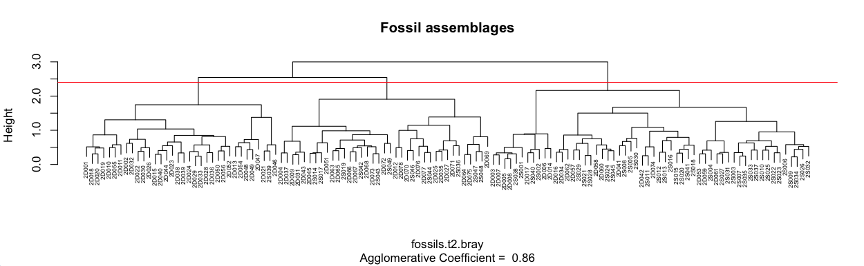
A line was added to the plot at a height of 2.4, and at this level of similarity, three main clusters are apparent. Each cluster could be divided more finely if that aided the interpretation. For example, the middle of these three clusters has two main subclusters. Analysis of them might show that this is a useful subdivision.
It is useful to understand why clusters group together, that is, it is useful to summarize the composition of each cluster. For ecological data, we could add up the abundance of each taxon in that cluster, re-express them as percentages, and sort them from the lowest to the highest. The first step in this process is to find the samples that mark the endpoints of each cluster. From our dendrogram, sample 2D001 is the left-most sample in cluster 1, and 2D046 is the rightmost. For cluster two, these endpoints are 2D004 and 2D069; for cluster three, they are 2D003 and 2S032. The order object in agnes is a vector that gives the order of our original row numbers (in fossilsT2Bray, which is the same order as fossilsT2. and fossils) on the dendrogram. We need to find the set of original row numbers in each cluster, which can be done with the which() command.
cluster1 <- fossilsT2BrayAgnes$order [which(fossilsT2BrayAgnes$order.lab=="2D001") : which(fossilsT2BrayAgnes$order.lab=="2D046")]
cluster2 <- fossilsT2BrayAgnes$order [which(fossilsT2BrayAgnes$order.lab=="2D004") : which(fossilsT2BrayAgnes$order.lab=="2D069")]
cluster3 <- fossilsT2BrayAgnes$order [which(fossilsT2BrayAgnes$order.lab=="2D003") : which(fossilsT2BrayAgnes$order.lab=="2S032")]
This code looks complicated, but it finds the row numbers in our original data that correspond to each of the clusters. From this, extracting the fossil counts for all the samples in each cluster is easy.
cluster1Fossils <- fossils[cluster1, ]
cluster2Fossils <- fossils[cluster2, ]
cluster3Fossils <- fossils[cluster3, ]
From these collections, we can use colSums() to total each taxon's abundances, convert them to a percentage, sort them from largest to smallest, then round them off to make them easier to read.
round(sort(colSums(cluster1Fossils) / sum(colSums(cluster1Fossils)), decreasing=TRUE), digits=2)
round(sort(colSums(cluster2Fossils) / sum(colSums(cluster2Fossils)), decreasing=TRUE), digits=2)
round(sort(colSums(cluster3Fossils) / sum(colSums(cluster3Fossils)), decreasing=TRUE), digits=2)
Cluster 1 is dominated by ramose trepostome bryozoans (ramos; 17%), strophomenid brachiopods (strop; 14%), dalmanellid brachiopods (dalma; 14%), and the brachiopod Rafinesquina (Rafin; 14%), a relatively deep-water association. Cluster 2 is dominated by Rafinesquina (Rafin; 29%), the brachiopod Zygospira (Zygos; 25%), and ramose trepostome bryozoans (ramos; 19%), a mid-depth association. Cluster 3 is dominated is dominated by ramose trepostome bryozoans (ramos; 42%), the brachiopod Hebertella (Heber; 11%) and the brachiopod Platystrophia ponderosa (Ponde; 8%), a characteristic shallow-water association.
This interpretation is confirmed by the letters in the sample names, where D indicates deep subtidal and S indicates shallow subtidal. All but one of the samples from cluster 1 are from the deep subtidal, about two-thirds of the samples in cluster 2 are from the deep subtidal, and two-thirds of the samples in cluster 3 are from the shallow subtidal.
Non-ecological data
Cluster analysis can also be applied to non-ecological data to find groups of similar samples. This example applies it to the Nashville carbonates geochemistry data, which consists of geochemical measurements on limestone. The geochemical measurements are extracted from the data frame, and a log+1 transformation is applied to the right-skewed major elements.
nashville <- read.table("NashvilleCarbonates.csv", header=TRUE, row.names=1, sep=",")
colnames(nashville)
geochem <- nashville[, 2:9]
geochem[, 3:8] <- log10(geochem[, 3:8] + 1)
To give all variables equal weight in the cluster analysis, a percent maximum transformation is applied using the decostand() function from the vegan library.
library(vegan) geochemT1 <- decostand(geochem, method="max")
The default Euclidean distance is appropriate for the cluster analysis as is the default arithmetic averaging linkage method. Note that in this case, agnes() is called on the data rather than a distance matrix, as in the ecological example.
geochemT1Agnes <- agnes(geochemT1)
Plotting is done the same as in the ecological example.
plot(geochemT1Agnes, which.plots = 2, main="Limestone geochemistry", cex=0.5)
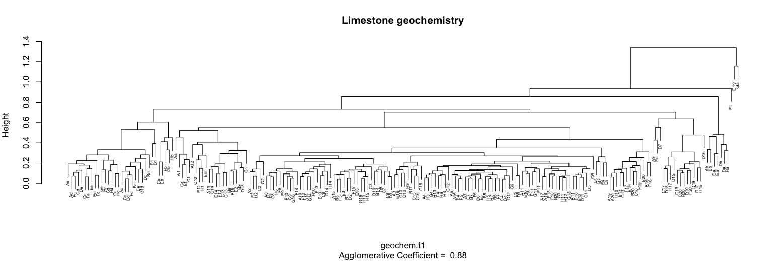
This dendrogram shows the presence of several clusters, including a large one in the center of the plot. The presence of outliers is suggested by the two samples at the far right that join at a low level of similarity and by an additional sample just to their left that also joins at a low level of similarity. It is often useful to remove such samples and re-run the cluster analysis.
The composition of these clusters could also be calculated as in the ecological example above, but this is, as they say, an exercise left for the reader.
References
Kaufman, L. and P.J. Rousseeuw, 1990. Finding Groups in Data: An Introduction to Cluster Analysis. Wiley, New York.
Legendre, P., and L. Legendre, 1998. Numerical Ecology. Elsevier: Amsterdam, 853 p.
McCune, B., and J.B. Grace, 2002. Analysis of Ecological Communities. MjM Software Design: Gleneden Beach, Oregon, 300 p.
