Plotting Concepts
First rule of data analysis: plot your data
Nothing is more effective for understanding the nature of your data than seeing a plot. This is true for both you and your audience. Plots should be designed to show the data in the most effective way. There are many guides for types of plots to help data visualization; the Data Visualisation Catalogue is one of my favorites.
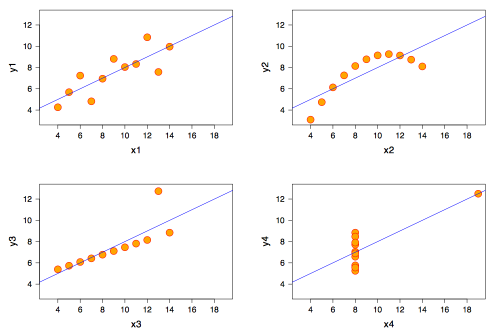
Although statistics like mean, variance, correlation, etc., are important ways of summarizing your data, none of them can ever give a complete picture of your data. For example, Anscombe’s quartet, shown below, depicts four data sets, each with same x mean, y mean, x variance, y variance, correlation, and least-squares linear regression - yet the four data sets are clearly different. Only a picture can convey this. Read more Anscombe’s quartet at Wikipedia, the source of the image below.
Before you do any quantitative analysis of your data, plot it.
Edward Tufte’s principles
Edward Tufte (pronounced “Tuf-tee”) is a famous statistician who has emphasized the proper display of data. His most important principle is to maximize the data to ink ratio, within reason. He describes several ways to do this.
First, eliminate chart junk, such as vibrating graphics, such as the various striped and checkered patterns that many software packages offer. Don’t label every tick mark along an axis. Typically, only 3–5 marks need to be labeled to make a plot easy to read. Avoid using 3-D plots, when the third dimension adds no information. In general, plots generated by most computer software will need editing. Eliminate grids, such as the horizontal and vertical lines that many software packages include by default. This also applies to numerous boxes around plots. Avoid using computer-generated acronyms when plotting data; use real names instead. Don’t duplicate axes on the top and bottom of a plot or on the right and left. The bottom line is that anything that does not help convey information is extraneous and should be removed. Remember, the goal is to emphasize the data.
There are many positive things you can do to make plots more effective
Label important features directly. Avoid using keys or legends, which require the viewer to shift their focus repeatedly. You should aim to keep their eyes on the data.
Use small multiples when you have many versions of similar plots, such as the same plot for many different data sets. Arrange these grids sensibly. For example, if all of the plots have the same x-axis, but have different y-axes, they should be stacked vertically and share a single x-axis. Eliminating the duplicated axes simplifies the plot and makes it clear to the viewer that all of the plots have the same axis.
Have a clear visual hierarchy. The most important items should stand out and the least important should fade away. This can be accomplished by choice of colors, symbols, fonts, font sizes, and line weights. The data should be the most prominent element.
Be consistent. Use the same line weights, fonts, and colors. This consistency applies to all figures used in a talk or a paper. Don’t just recycle plots from previous talks when they are prepared in a different style; reformat them for consistency.
Choose an appropriate aspect ratio. The ideal plot is about 50% wider than tall, but this will vary depending on the type of plot and what is being conveyed. Do not simply accept the default of your plotting program.
Use color to convey information, not for decoration. Use color for emphasis; brighter and bolder colors should be used for the most important elements. Choose colors carefully to balance one another. Avoid harshly contrasting colors. Use colors to make connections between figures and slides, such as using a limited palette of colors consistently. Watch for color blindness: 7–10% of the men in your audience will be unable to distinguish red and green. Yellow and blue color blindness is rare, as is color blindness in women. Lisa Charlotte Muth offers a great set of guidelines for picking colors.
Types of plots
Column and bar charts are used to shown the number of items in different classes. Sometimes, they are used to show measurements from different groups, but x-y plots are generally more effective for this. The bars should be joined to one another if classes are contiguous, but should be separated by a space if they are not.
Histograms look similar to bar graphs, but serve a special purpose: they display a frequency distribution of the data, that is, the number of times any particular observation occurs in the data. Histograms are often the first plot you should make.
Rose diagrams are a special type of histogram for displaying directional data.
Strip charts are useful for visualizing data distributions when sample size is small.
Scatterplots, also called X-Y plots are used to plot one set of measurements against another set. If one variable is the independent or controlling variable, it is typically placed on the abscissa, or x-axis, with the dependent or response variable on the ordinate, or y-axis. In many data sets from natural systems, neither variable may be independent or controlling, in which case, convention or aesthetics may dictate on which axis a variable is plotted.
Contour plots also called surface plots are used to show three variables, often where two of the variables record spatial position. Contour plots may be filled, shaded, or colored. Contour plots should be used in cases where the third variable changes more or less smoothly relative to the other two.
Bubble plots are also used to show 3 variables, when the third variable shows a considerable amount of noise.
Pie charts are not often used, but are effective at showing proportions of a whole. Because humans are much better at perceiving lengths than they are volumes, stacked bar charts are often a better choice.
Ternary diagram are used to show proportions when three components are summed to 100%.
Lecture slides
Download a pdf of the slides used in today’s lecture.
References
A few hours reading one of Tufte’s books is time well spent. If you have time to read only one, start here:
Tufte, E.R., 1983, The visual display of quantitative information: Cheshire, Connecticut, Graphics Press, 197 p.
You will also find these helpful:
Tufte, E.R., 1990, Envisioning Information. Cheshire, Connecticut, Graphics Press.
Tufte, E.R., 1997, Visual Explanations: Images and Quantities, Evidence and Narrative. Cheshire, Connecticut, Graphics Press.
Tufte, E.R., 1997, Visual & Statistical Thinking: Displays of Evidence for Decision Making. Cheshire, Connecticut, Graphics Press.
Tufte, E.R., 2003, "PowerPoint is evil". Wired 11 (9). Available online.
Tufte, E.R., 2006, The Cognitive Style of PowerPoint (2nd ed.). Cheshire, Connecticut, Graphics Press.
Tufte, E.R., 2006, Beautiful Evidence. Cheshire, Connecticut, Graphics Press.
Tufte’s website is also useful. Yes, I am a fan of Edward Tufte.
