Principal Components Analysis
Introduction
Suppose we had measured two variables (length and width) and plotted them as shown below. The two are highly correlated with one another. We could pass one vector through the long axis of the cloud of points, with a second vector at right angles to the first. Both vectors are constrained to pass through the centroid of the data.
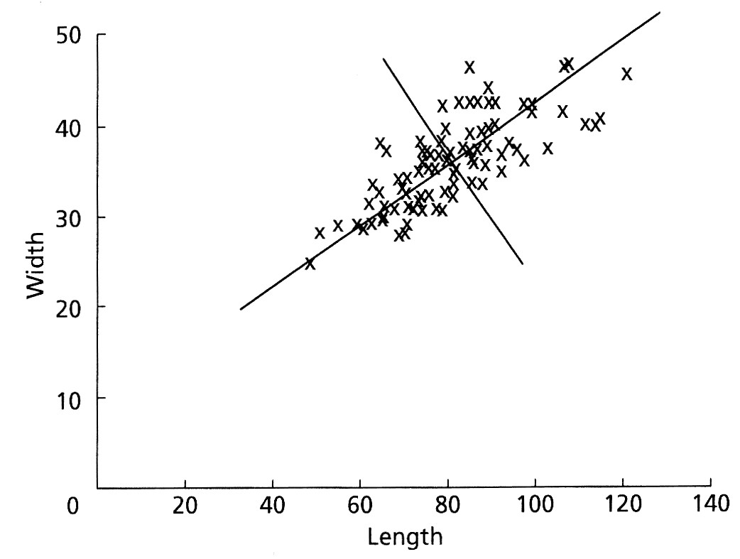
Once we have made these vectors, we could measure the coordinates of every data point relative to these two perpendicular vectors and re-plot the data, as shown here (both of these figures are from Swan and Sandilands, 1995).
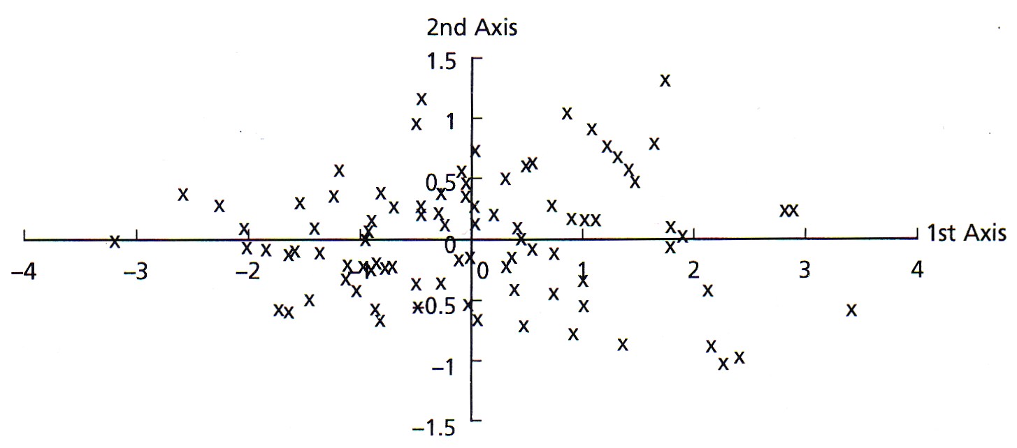
By rotating the data to this new reference frame, the variance is now greater along axis 1 than it is on axis 2. Also, because we have just rotated the data, their spatial relationships of the points are unchanged: it is the same data, just plotted in a new set of coordinates. Last, the new axes created by this rotation are uncorrelated with each other. Mathematically, the orientations of these axes relative to the original variables are called the eigenvectors, and the variances along these axes are called the eigenvalues.
By performing such a rotation, the new axes might have particular explanations. In this example, axis 1 could be interpreted as a size measure, likely reflecting age, with samples on the left having both small lengths and widths and samples on the right having large lengths and widths. Axis 2 could be regarded as a measure of shape, with samples at any axis 1 position (that is, of a given size) having different length-to-width ratios. These axes contain the information contained in our original variables, but they do not coincide exactly with any of the original variables.
In this simple example, these relationships may seem obvious. When dealing with many variables, this process allows you to assess relationships among variables very quickly. For data sets with many variables, the variance of some axes may be great, whereas the variance on others may be so small that they can be ignored. This is known as reducing the dimensionality of a data set. For example, you might start with thirty original variables but end with only two or three meaningful axes. The formal name for this approach of rotating data such that each successive axis has a decreasing variance is Principal Components Analysis or PCA. PCA produces linear combinations of the original variables to generate these axes known as principal components or PCs.
Computation
To perform a PCA, the data set should be in standard matrix form, with n rows of samples and p columns of variables. There should be no missing values: every variable should have a value for every sample, and this value may be zero.
A principal component analysis is equivalent to major axis regression; it applies major axis regression to multivariate data. Principal component analysis is therefore subject to the same restrictions as regression. In particular, the data needs to be multivariate normal, which can be evaluated with the MVN package. Data transformations should be used where necessary to correct for skewness. Outliers should be removed from the data set as they can dominate the results of a principal components analysis.
The first step in the PCA is to center the data on the means of each variable, accomplished by subtracting the mean of a variable from all values of that variable. Doing this ensures that the cloud of data is centered on the origin of our principal components, but it does not affect the spatial relationships of the data nor the variances along our variables. The new center point of our data is the mean of each measurement and is called the centroid.
The first principal component (Y1) is a linear combination of the variables X1, X2, ..., Xp

expressed in matrix notation by

The first principal component is calculated such that it accounts for the greatest possible variance in the data. Of course, one could make the variance of Y1 as large as possible by choosing large values for the weights a11, a12, ... a1p. To prevent this, the sum of squares of the weights is constrained to be 1.
The second principal component is calculated in the same way, with the conditions that it is uncorrelated with (i.e., perpendicular to) the first principal component and that it accounts for the next highest variance.

This continues until a total of p principal components have been calculated; in other words, there are as many PCs as there are variables. The total variance on all the principal components will equal the total variance among all the variables. In this way, all the information contained in the original data is preserved; no information is lost: PCA is just a rotation of the data. In matrix notation, the transformation of the original variables to the principal components is written as

Calculating these transformations or weights is complex and requires a computer for all but the smallest matrices using a method called singular value decomposition. The rows of matrix A are called the eigenvectors, which specify the orientation of the principal components relative to the original variables. The elements of an eigenvector, that is, the values within a particular row of matrix A, are the weights aij. These values are called the loadings, which describe how much each variable contributes to a particular principal component. Large loadings (positive or negative) indicate that a particular variable strongly relates to a particular principal component. The sign of a loading indicates whether a variable and a principal component are positively or negatively correlated.
From matrix A and matrix Sx (the variance-covariance matrix of the original data), the variance–covariance matrix of the principal components can be calculated:

The elements in the diagonal of matrix Sy are the eigenvalues, which correspond to the variance explained by each principal component. These are constrained to decrease monotonically from the first principal component to the last. Eigenvalues are commonly plotted on a scree plot to show the decreasing rate at which variance is explained by additional principal components. The off-diagonal elements of matrix Sy are zero because the principal components are constructed such that they are independent and therefore have zero covariance. The square roots of the eigenvalues (the standard deviations of the principal components) are called the singular values (as in singular value decomposition).
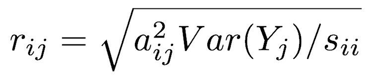
Because PCA is simply a rotation, the original variables are correlated to the principal components to varying degrees. The correlation of variable Xi and principal component Yj is
The positions of each observation in this new coordinate system of principal components are called scores. These are calculated as linear combinations of the original variables and the weights aij. For example, the score for the rth sample on the kth principal component is calculated as

Because dimensionality reduction is a goal of principal components analysis, several criteria have been proposed for determining how many PCs should be examined and how many should be ignored. Using the scree plot, four criteria are commonly used for determining how many PCs should be examined closely:
- Ignore all subsequent PCs when a PC offers little increase to the total explained variation.
- Include all PCs up to a predetermined total percent explained variation, such as 90%.
- Ignore components whose explained variation is less than 1 when a correlation matrix is used or less than the average variation explained when a covariance matrix is used, with the idea being that such a PC offers less than one variable’s worth of information.
- Ignore the last PCs whose explained variances are all roughly equal.
PCA in R
Although the steps just described for performing a principal components analysis may seem complex, running a PCA in R is usually accomplished with one command. Several packages implement PCA, and the demonstration below uses the prcomp() function in the built-in stats package.
Prepare the data
First, import the data. Cull samples or variables as needed to remove missing values. Perform any necessary data transformations to remove outliers and achieve something approaching multivariate normality.
Here, we will use the Nashville carbonates geochemistry data set, a set of geochemical measurements on Upper Ordovician limestone beds from central Tennessee (Theiling et al. 2007). The first column contains the stratigraphic position, which we will use as an external variable to interpret our ordination; in other words, we will not use it in the PCA but use it to interpret the PCA. The remaining columns (2–9) contain geochemical data, which is what we want to ordinate with PCA, and we will pull those off data as a separate object. The first two columns of the geochemical data are stable isotopic ratios that need no transformation, but the remaining columns (3–9) are weight percentages of major oxides, and these need to a log transformation to correct their positive skewness (long right tails).
nashville <- read.table("NashvilleCarbonates.csv", header=TRUE, row.names=1, sep=",") colnames(nashville) geochem <- nashville[ , 2:9] geochem[ , 3:8] <- log10(geochem[ , 3:8])
Run the PCA
Run the PCA with prcomp(), and assign it to an object (of type prcomp), so you can make plots and use the results in various ways.
In this example, we want all variables to have an equal effect on the ordination rather than having numerically large variables (abundant elements) dominate the results. To achieve this, we set scale.=TRUE, which transforms the variables so their standard deviations are all 1.
After running the PCA, I recommend extracting important parts (the standard deviation of each principal component, the loadings for each variable, and the scores for each sample) as their own objects, which will simplify our code later. This also lets us call these objects by their common names (loadings, scores), rather than by R’s less obvious names (rotation, x).
geochemPca <- prcomp(geochem, scale.=TRUE) sd <- geochemPca$sdev loadings <- geochemPca$rotation rownames(loadings) <- colnames(geochem) scores <- geochemPca$x
Use a scree plot to reduce dimensionality
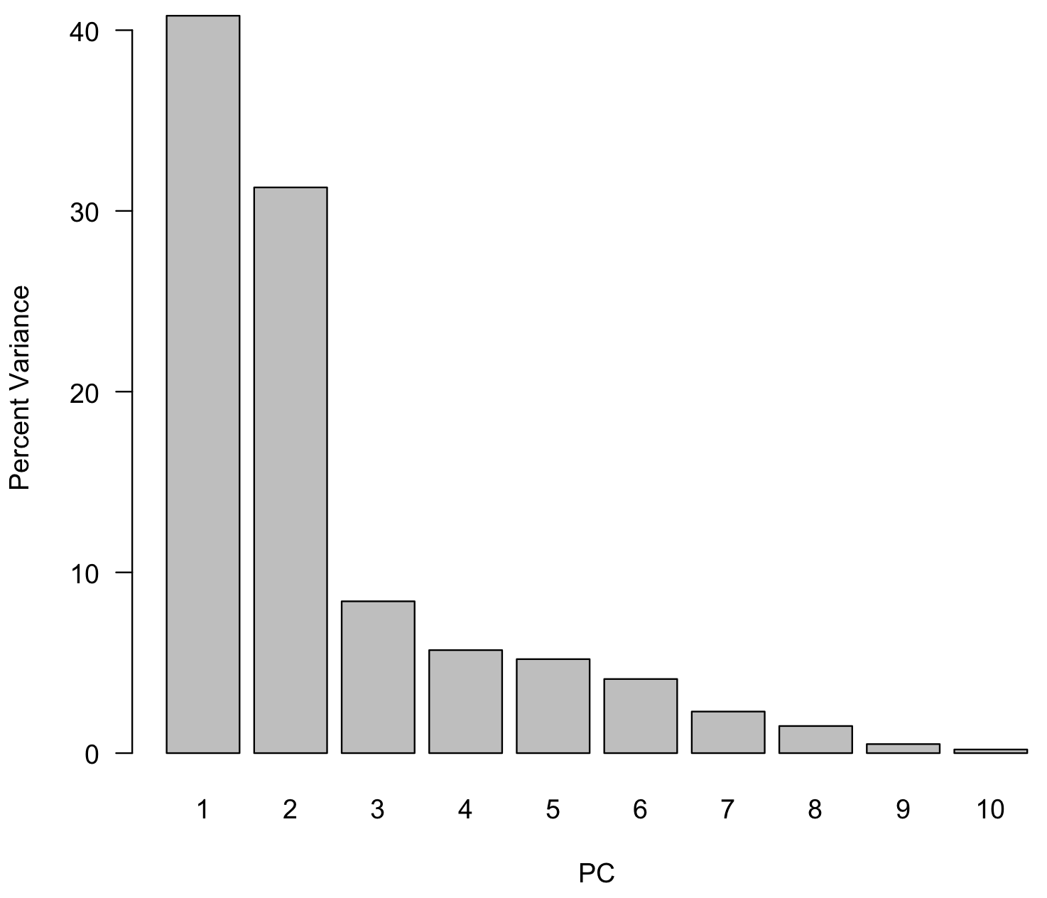
To interpret the results, the first step is to determine how many principal components to examine, at least initially. Although PCA will return as many principal components as there are variables (eight, here), a goal of PCA is to reduce dimensionality, so we will concentrate our initial interpretations on the largest principal components. To do this, we will create a scree plot that shows the percent of total variance explained by each principal component. We will also add a line indicating the amount of variance each variable would contribute if all contributed the same amount. This is just a horizontal line drawn at 1/p, where p is the number of variables (or PCs).
var <- sd^2 varPercent <- var/sum(var) * 100 dev.new() barplot(varPercent, xlab="PC", ylab="Percent Variance", names.arg=1:length(varPercent), las=1, ylim=c(0, max(varPercent)), col="gray") abline(h=1/ncol(geochem)*100, col="red")
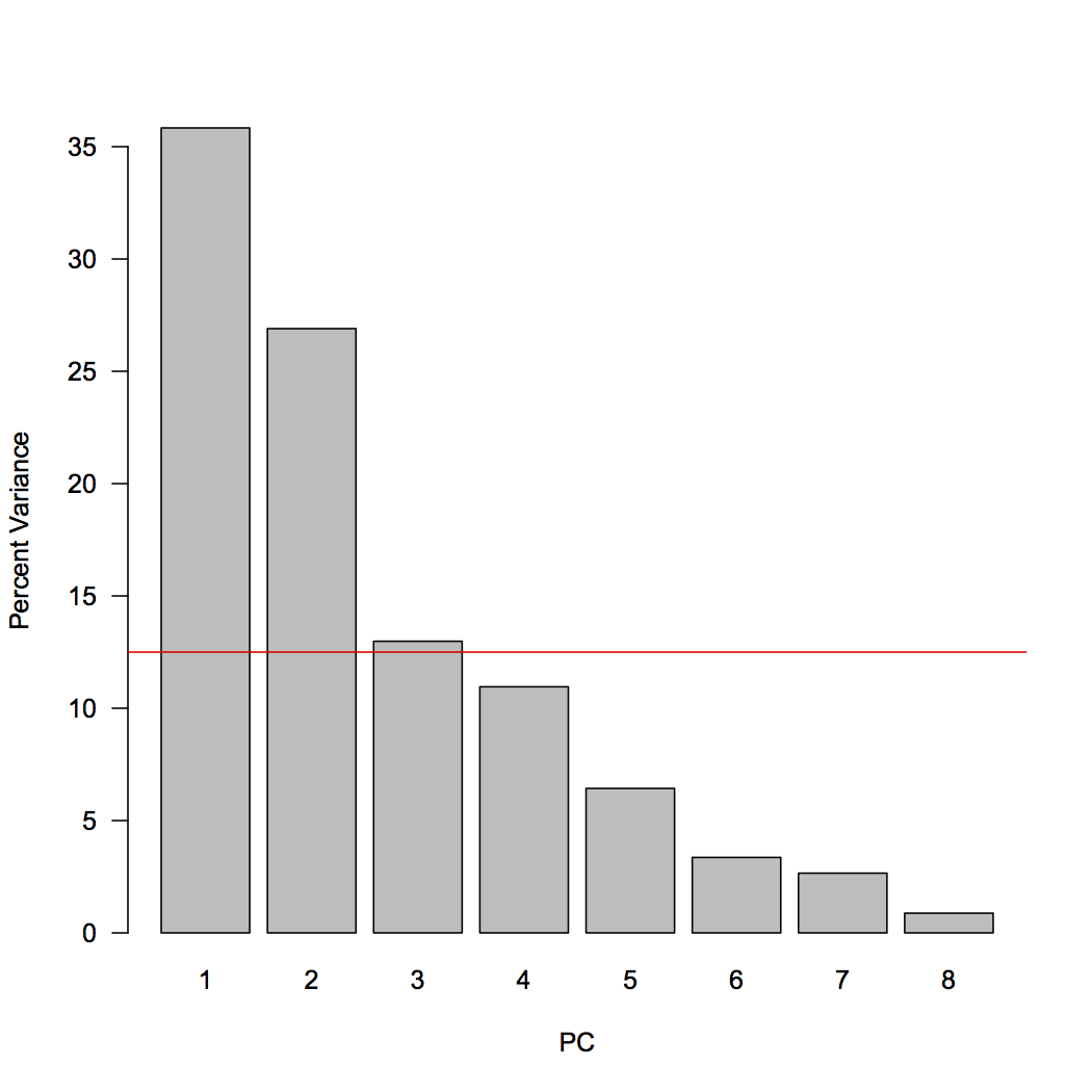
We can now examine the scree plot and consider the criteria for deciding how many PCs we should focus on. For criterion #1, scan the scree plot for a marked drop in the percentage of explained variation, and ignore principal components that explain relatively little variation. Here, principal components 1 and 2 explain a large proportion of the variance, and subsequent principal components explain much less. This would suggest we should focus primarily on principal components 1 and 2.
For criterion #3, consider which principal components explain more than one variable’s worth of information. If each of the eight variables contributed equally to variance, each contribute 12.5%, indicated by the red line. This criterion suggests we should also include principal component 3 (barely) in our interpretation.
In this case, we do not have a predetermined value of variance we wish to explain, so we cannot use criterion #2. All of the PCs from PC4 and higher have similar low values of explained variance, so that supports are decision to focus on 2 or 3 PCs.
When we report our results, we should state the explained variance of each principal component we will examine in more detail, plus their combined explained variance. Those can be calculated exactly:
varPercent[1:3] sum(varPercent[1:3])
The first three principal components account for just over 75% of the explained variance in this case.
Create a table of the loadings
The next step in our interpretation is to understand how our variables contribute to each principal component, and the loadings reveal this. Positive loadings indicate a variable and a principal component are positively correlated: an increase in one results in an increase in the other. Negative loadings indicate a negative correlation. Large (positive or negative) loadings indicate that a variable strongly affects that principal component. We need to scan the table to find those large loadings, and we first need a criterion of what constitutes a “large” loading. Because the sum of the squares of all loadings for an individual principal component must sum to one, we can calculate the loadings if all variables contributed equally to that principal component. Any variable with a larger loading than this value contributes more than one variable’s worth of information and would be regarded as an important contributor to that principal component.
loadings sqrt(1/ncol(geochem))
A table of loadings should always be presented for the principal components that are used. It is helpful to rearrange the rows so that variables that contribute strongly to principal component 1 are listed first, followed by those that contribute strongly to principal component 2, and so on. Large loadings can be highlighted in boldface to emphasize the variables contributing to each principal component. Use a consistent cutoff when deciding what to bold
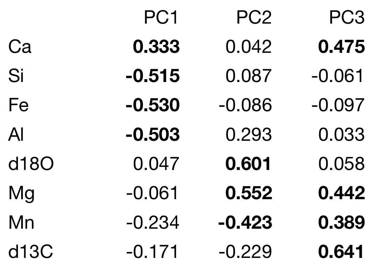
In this example, the loadings are readily interpretable. Axis 1 has a strong positive loading for calcium and strong negative loadings for silicon, iron, and aluminum. Because these are analyses of limestone, this likely reflects relatively pure limestone at positive axis 1 scores and increasing clay content at negative axis 1 scores. Axis 2 has strong positive loadings for δ18O and magnesium, which may reflect dolomitization. The reason for the strong negative loading of manganese is unclear, although someone familiar with limestone diagenesis may know what it could reflect. Axis 3 is dominated by large positive loadings for δ13C, which may reflect oceanographic processes controlling the carbon isotopic composition of these limestones.
Plot sample scores
The last step is to visualize the distribution of the samples in this new ordination space, which is just a rotation of our original variable space. The scores describe the location of our samples, and we will plot these as scatterplots, starting with the most important pair of principal components (1 and 2). This is called a distance biplot, and it shows samples as points and loadings as vectors. These vectors portray how an increase in a given variable influences where a sample plots in this space. R has a built-in function for making a distance biplot called biplot.prcomp(). If we supply it a prcomp object, we can call it with biplot().
dev.new(height=7, width=7) biplot(geochemPca, cex=0.7)
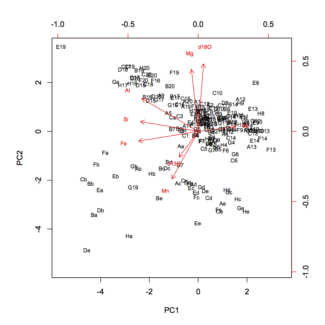
Generating a biplot ourselves gives us greater control in what we show. In this example, we have a scaling variable, which controls the length of the vectors, and a textNudge variable, which controls how far beyond the vector tips the labels appear. If you use this code for your own PCA, you will need to adjust the values of scaling and textNudge to get the vectors as long as possible while keeping their labels on the plot.
dev.new(height=7, width=7) plot(scores[, 1], scores[, 2], xlab="PC 1", ylab="PC 2", type="n", asp=1, las=1) scaling <- 5 textNudge <- 1.2 arrows(0, 0, loadings[, 1]* scaling, loadings[, 2]* scaling, length=0.1, angle=20, col="red") text(loadings[, 1]*scaling*textNudge, loadings[, 2]*scaling*textNudge, rownames(loadings), col="red", cex=0.7) text(scores[, 1], scores[, 2], rownames(scores), col="blue", cex=0.7)
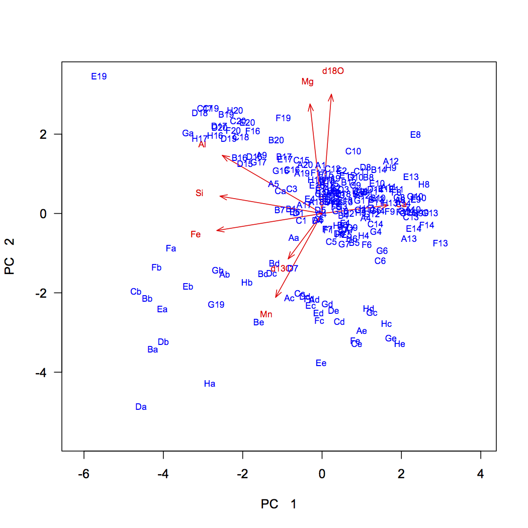
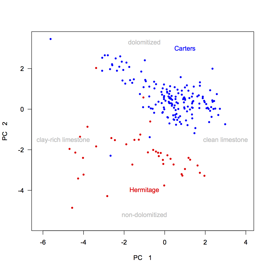
One advantage of creating your own biplot is that it allows you to color-code samples by external variables to see if they sort according to them. Here, the stratigraphic position was our external variable, and a major boundary occurs at 34.2. Samples below this belong to the Carters Formation and samples above are in the Hermitage Formation. We can code vectors for these and use these to plot their samples.
dev.new(height=7, width=7) Carters <- nashville$StratPosition < 34.2 Hermitage <- nashville$StratPosition > 34.2 plot(scores[, 1], scores[, 2], xlab="PC 1", ylab="PC 2", type="n", asp=1, las=1) points(scores[Carters, 1], scores[Carters, 2], pch=16, cex=0.7, col="blue") points(scores[Hermitage, 1], scores[Hermitage, 2], pch=16, cex=0.7, col="red") text(1, 3, "Carters", col="blue") text(-1, -4, "Hermitage", col="red")
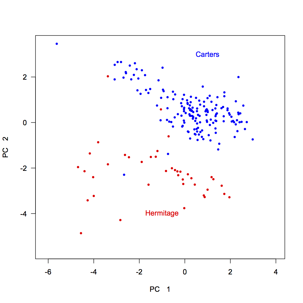
This shows that samples from these two formations separate nearly perfectly. Interestingly, two Carters samples plot within the Hermitage field, and vice versa, suggesting we should examine our samples again. In reexamining the rock samples that were analyzed, we discovered that the two Carters samples within the Hermitage field were intraclasts: pieces of eroded Carters rock that were deposited in the base of the Hermitage.
We can combine this biplot with a knowledge of our variables derived from the loadings. Both stratigraphic units show variation along principal component 1, which is controlled by lithology: carbonate-rich rocks on the right (high in Ca) and clay-rich rocks on the left (high in Si, Al, and Fe). The two formations separate along principal component 2, with Carters Formation samples having high d18O and Mg values, possibly indicating dolomitization, and Hermitage Formation samples having high d13C and Mn values, tied to a change in seawater chemistry. Adding annotations like this can make a PCA biplot easily interpretable to a reader. Notice that these annotations are in light gray: the data should always be the most prominent part of any plot.
text(-1, -4.9, "non-dolomitized", pos=3, col="gray") text(-1, 3, "dolomitized", pos=3, col="gray") text(2.6, -1.8, "clean limestone", pos=3, col="gray") text(-5, -1.8, "clay-rich limestone", pos=3, col="gray")
If you have multiple external variables, you can color-code each of those variables on a different plot to understand how those variables are arrayed in ordination space. You can also make similar biplots for the higher principal components (axes 3 and up).
Correlation biplots
Distance biplots accurately show the relative distances between points. Another approach is to make a correlation biplot, which will more accurately portray the correlations between the variables, which are distorted in a distance biplot. It is not geometrically possible to accurately show the distance relationships of samples and the correlations of the variables on a single plot, so one must choose which is the goal and make the appropriate plot.
For some data sets, the distance biplot and correlation plot differ only subtly; for others, the difference is more apparent. Where the two plots differ appreciably, and when you need to convey graphically the correlations among the variables and their relationships to the principal components, you must also make a correlation biplot.
The simplest way of making a correlation biplot is to add one argument (pc.biplot=TRUE) to the biplot() command.
dev.new(height=7, width=7) biplot(geochemPca, cex=0.7, pc.biplot=TRUE)
To make a correlation biplot directly, such as when you want to have more control over labeling, multiply the sample scores by the standard deviation for the corresponding principal component (that is, the square root of the eigenvalue), and multiply the loadings by those standard deviations. As before, scaling is used to lengthen the vectors, and textNudge ensures that the labels plot just beyond the arrowheads. Both may need to be adjusted to get the arrows to be of a useful length, large enough to be easily visible but small enough to fit on the plot.
dev.new(height=7, width=7) plot(scores[, 1]/sd[1], scores[, 2]/sd[2], xlab="PC 1", ylab="PC 2", type="n", las=1) scaling <- 2 textNudge <- 1.2 arrows(0, 0, loadings[, 1]*sd[1]*scaling, loadings[, 2]*sd[2]*scaling, length=0.1, angle=20, col="red") text(loadings[, 1]*sd[1]*scaling*textNudge, loadings[, 2]*sd[2]*scaling*textNudge, rownames(loadings), col="red", cex=0.7) text(scores[, 1]/sd[1], scores[, 2]/sd[2], rownames(scores), col="blue", cex=0.7)
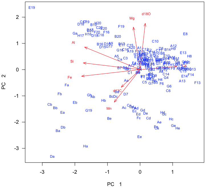
For this data set, the correlation biplot is not obviously different from the distance biplot, so there may be no advantage to showing it. For other data sets, the angles between the loading vectors may look substantially different, and the correlation biplot should be included, especially if you need to discuss the correlations among the variables.
What to report
When reporting a principal components analysis, always include at least these items:
- A description of any data culling or transformations used prior to ordination. State these in the order that they were performed.
- Whether the PCA was based on a variance-covariance matrix (i.e., scale.=FALSE) or a correlation matrix (i.e., scale.=TRUE).
- A scree plot of the explained variance of each of the principal components that shows the criteria used for selecting the number of principal components to be studied.
- A table that shows the loadings of every variable on each PC that was studied. The table should highlight (e.g., with boldface) the dominant loadings on each PC.
- One or more plots of sample scores that emphasize the interpretation of the principal components by color-coding samples with an external variable. It may be useful to show the vectors corresponding to the loadings on these plots.
PCA results can be complex, and it is important to remember the GEE principle in your writing, which stands for Generalize, Examples, Exceptions. Begin each paragraph with a generalization about the main pattern shown by the data. Next, provide examples that illustrate that pattern. Cover the exceptions to the pattern last. For a PCA, you might begin with a paragraph on variance explained and the scree plot, followed by a paragraph on the loadings for PC1, then a paragraph for loadings on PC2, etc. These would then be followed by paragraphs on sample scores for each PC, with one paragraph for each PC. If you do this in all your writing about data, not just PCA, it will be much easier for your readers to follow.
Applications
PCA is useful in any situation where many variables are correlated, and you would like to reduce the dimensionality by using fewer variables. Reducing dimensionality helps identify patterns among the variables and commonalities among the rows (or objects).
A second situation where PCA is useful is when you have many predictor variables in a regression, and those variables show multicollinearity. One option is to remove variables, but if you have many variables, you may still be left with too many variables to make regression straightforward, given the multiple paths that are possible in backward elimination. A better option is to run a PCA on the predictor variables and use the first few PCs as the predictor variables in the regression. This removes the multicollinearity and makes the creation of a regression model simpler.
A third situation where calling for PCA is when you have many time series from many geographic locations, as is common in meteorology, oceanography, and geophysics, especially for the output of numerical models. PCA of this data can reduce the dimensionality of this data, making it much simpler to identify the important spatial and temporal patterns. This type of PCA is called an Empirical Orthogonal Function or EOF.
Matrix operations
For the curious, using matrix operations to perform a principal components analysis is straightforward. Here's how.
References
Legendre, P., and L. Legendre, 1998. Numerical Ecology. Elsevier: Amsterdam, 853 p.
Swan, A.R.H., and M. Sandilands, 1995. Introduction to Geological Data Analysis. Blackwell Science: Oxford, 446 p.
Theiling, B.P., L.B. Railsback, S.M. Holland, and D.E. Crowe, 2007. Heterogeneity in geochemical expression of subaerial exposure in limestones, and its implications for sampling to detect exposure surfaces. Journal of Sedimentary Research 77:159–169.
