Assumptions of Tests
Statistical tests are always based on a series of assumptions, and you must demonstrate that these are reasonable before using that test. You will often do this with some preliminary statistical tests. Other times, you may evaluate the assumptions graphically or verify the assumption through knowledge of your sampling design.
Violations of a test’s assumptions commonly cause the test to produce a spurious statistically significant result. If you do not verify the assumptions of a test before performing it, and if you achieve a statistically significant result, you will not know if it is because the null hypothesis is invalid or because one or more test assumptions have been violated. This leaves you in an ambiguous position, which you should avoid.
Always validate the assumptions of your statistical tests; do not assume that they are correct.
Random sampling
All statistical analyses assume that the data is a random sample of the population. A random sample is a sample that does not systematically include or exclude parts of the population. More formally, a random sample is an i.i.d. sequence, an independent and identically distributed sequence of observations. Let’s consider both parts of this definition.
Independence means that no observation controls the probability distribution of any other observation. For example, if we were studying human age distributions, a birthday party would be a poor place to get our sample since most people will have similar ages (kids, parents) and would therefore not be independent. Spatial and time-series data are particularly prone to non-independence, and special methods have been developed for them (e.g., geostatistics and time-series analysis).
Identically distributed means that the probability distribution of each observation is the same as that of the population. In other words, each item in the population has an equal opportunity of being included in our sample. In a biased sample, particular observations are systematically excluded or included, such that not all parts of the frequency distribution in the population have an equal opportunity of being sampled. For example, building a sample from only the highest-grade gold rocks from a potential ore body would mean that the frequency distribution of our sample would be quite different from the population, and it would assuredly mislead us about the characteristics of the population.
Good sampling design is the best way to achieve random sampling. Because all tests assume random sampling (an i.i.d. sequence), data analysis starts when you design the project; it is not something that starts after you have collected the data.
Parametric tests and normality
Parametric tests are one of the most widely used classes of statistics, and they assume a particular distribution, commonly a normal distribution (but not always). Non-parametric tests are sometimes described as distribution-free statistics because they make no assumptions about the distribution. Although a test with fewer assumptions sounds more flexible, there is a drawback: non-parametric tests typically have lower power than parametric tests.
Because many parametric tests assume normality in the data or the statistic, you must verify this normal distribution before running such a test.
Bimodal and multimodal distributions
Bimodality or multimodality is an obvious violation of normality, and these are usually evaluated with a frequency distribution. R’s hist() function works well for large data sets, and stripchart() is better for small data sets. Sampling, particularly at small sample sizes, can create multiple minor peaks in the data; you should not be generally concerned about such small deviations.
Bimodality and multimodality commonly indicate that your sample consists of a mixture of two or more groups. For example, the body weight distribution in hawks is bimodal: one mode represents females, and the other is males.
Skewness
One of the most problematic violations of normality is skewness, where one tail is substantially longer than the other. Sample skewness (G1) is calculated as follows:
R does not have a built-in function for skewness, but it can be calculated using this function:
skewness <- function(x) { n <- length(x) mean <- mean(x) m3 <- sum((x-mean)^3) / n s3 <- sd(x)^3 g1 <- n^2/((n-1)*(n-2)) * m3/s3 return(g1) }
A symmetrical distribution has zero skewness, a right-tailed distribution has positive skewness, and a left-tailed distribution has negative skewness. You can also check skewness by comparing the mean and median: for symmetrical distributions, the mean and median will be equal, but the mean will be pulled towards the longer tail in skewed distributions and therefore be larger than the median. For this reason, the median often better reflects central tendency than the mean, especially for skewed distributions.
Income is a good example of a skewed distribution, where a few wealthy people cause mean income to be substantially larger than median income. For example, the median household income in the United States in 2020 was $67,521, compared with a mean household income of $97,026 (Shrider et al. 2021, Table A-2). As a result, the U.S. Census Bureau typically reports median income rather than mean income. Many other things in nature have skewed distributions, particularly right-skewed ones.
Any time that negative values are impossible (e.g., length, mass, geochemical concentrations), be on the lookout for positive skewness and the need to correct for it.
Kurtosis
Kurtosis, which reflects the amount of data in the tails and center of a distribution than on the shoulders, is less of a concern for most parametric tests, at least those that assume normality.
R does not have a built-in function for kurtosis, but excess kurtosis (that is, kurtosis beyond that of a normal distribution, called G2) can be calculated with the following function:
kurtosis <- function(x) { n <- length(x) f1 <- n*(n+1) / ((n-1)*(n-2)*(n-3)) f2 <- sum((x-mean(x))^4) / sd(x)^4 f3 <- 3*(n-1)*(n-1) / ((n-2)*(n-3)) g2 <- f1 * f2 - f3 return(g2) }
Normal distributions have an excess kurtosis of 0. Distributions with greater amounts of data in the tails and center of the distribution (versus on the shoulders) are leptokurtic and have values of excess kurtosis greater than zero. Distributions that have most of their data on the shoulders and less in the peak and tails are called platykurtic and have negative excess kurtosis. It can be helpful to think of kurtosis as describing whether the main contributions to variance come from unusually large and small values (leptokurtic) versus values closer to the center of the distribution (platykurtic). Large kurtosis values therefore indicate values substantially farther from the mean than expected from a normal distribution.
Evaluating normality
Normality can be checked in many ways. Qualitatively, it can be checked by the shape of a frequency distribution. Visualize this distribution for large data sets with hist(). For small data sets, stripchart() is better because it show the observations directly and are not influenced by the number or location of breaks in the histogram. If ties in your data are possible, such as when the values are integers, use stripchart(method="stack"). In general, you are looking for symmetry: most of the data should be in the center of the distribution with an equal amount in each tail.
Use caution when visualizing the distribution of a small data set, as random sampling can create sample distributions that look non-normal. Beginning data analysts are commonly overly concerned about minor departures from normality that have little effect on statistical tests.
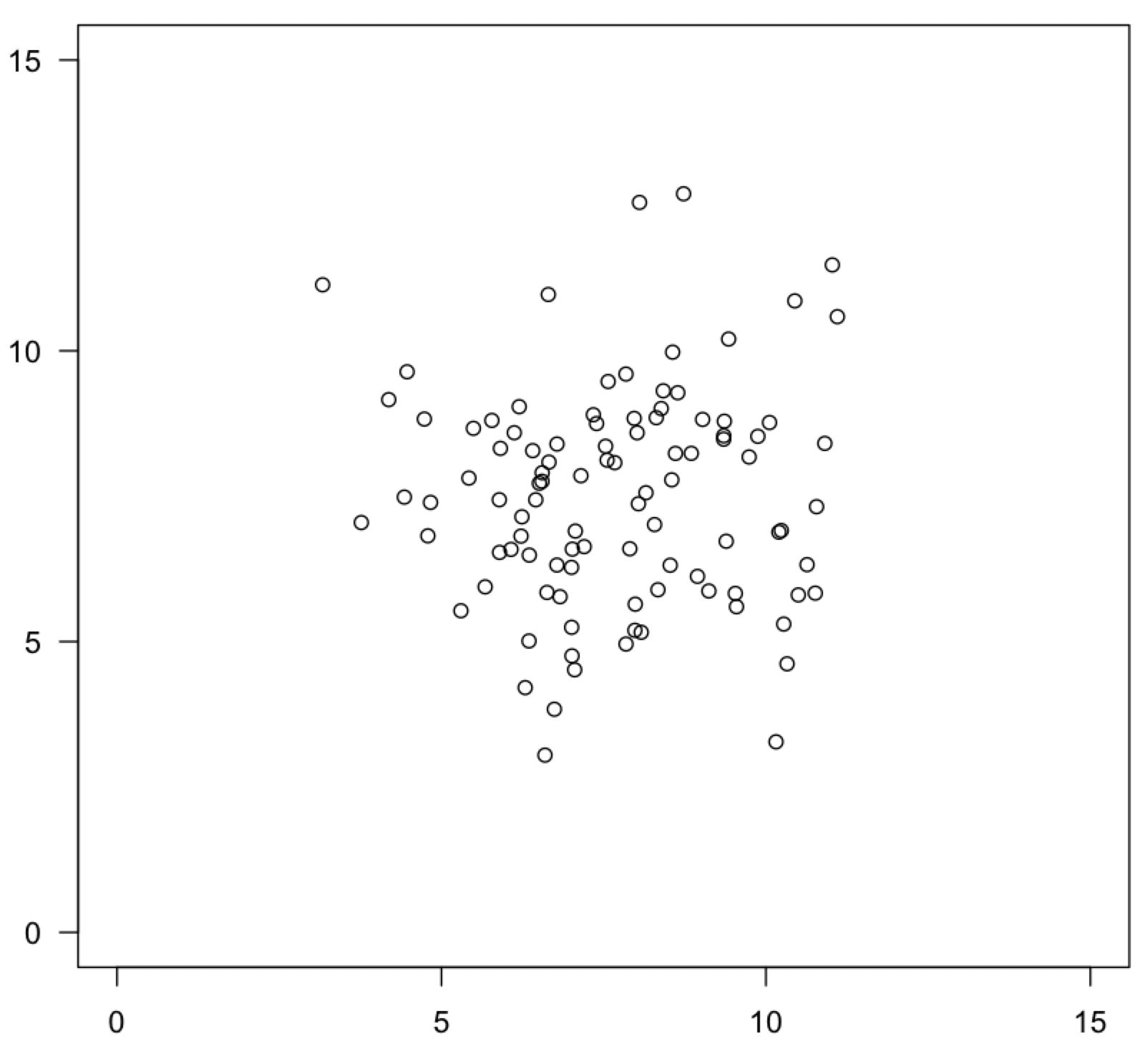
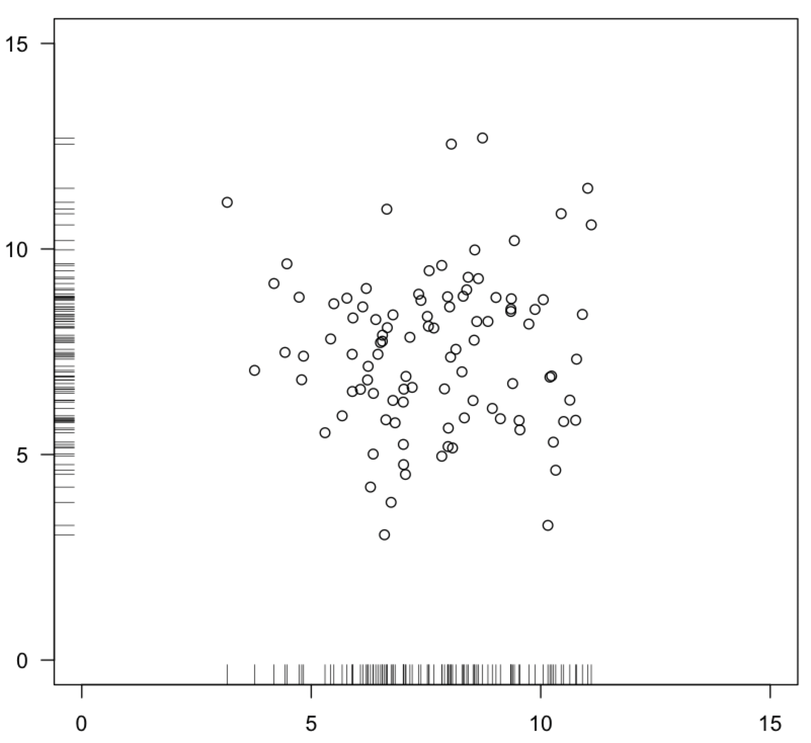
In bivariate data, where you have an x and a y variable, you can visualize bivariate normality on a scatter plot. For each axis, most of the data should fall in the center of the range on both axes, with an equal amount on either tail, evenly surrounding this central grouping on all sides. This is often referred to as a “shotgun blast”.
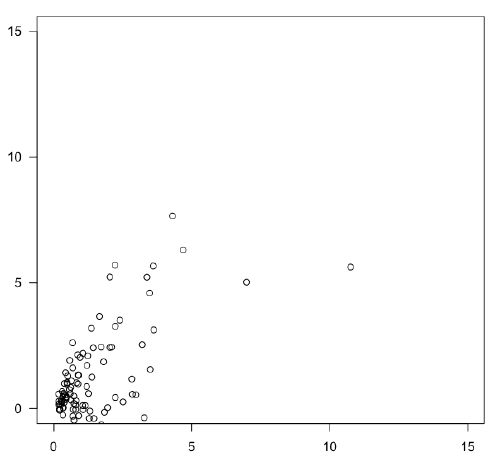
Beware of a “comet” distribution, where most data lies near the origin, with an expanding cloud of fewer and fewer points towards the top and right. This is a sign of positive skew on one or both axes. Such distributions are widespread in the natural sciences and often indicate log-normal distributions.
On a bivariate plot, you can also use the rug() function to show the distribution of points along each axis, similar to the stripchart() function. Remember to set the side argument for the y-variable to make it plot along the y-axis. The ticks along the axes let you better visualize the distributions on the two axes separately.
plot(x, y) rug(x) rug(y, side=2)
For bivariate data, be careful not to confuse how you sampled along the regression with whether the variables are normally distributed. For example, if you sampled from marshes, but collected more data from high-salinity marshes than low-salinity marshes, your data will look non-normally distributed along the salinity axis.
You can also evaluate normality qualitatively with a quantile-quantile plot (also called a normal probability plot), performed with the qqnorm() function. This type of plot compares the observed distribution to what would be expected if it was a normal distribution (explained in detail here). If the data are normally distributed, this plot will display a linear relationship. Some curvature is normal near the endpoints of the plot, even for normally distributed data, but substantial departures from a linear relationship indicate non-normality, particularly departures in the middle of the plot. Following qqnorm() with qqline() will add a line to help you assess the linearity.
qqnorm(x) qqline(x)
There are several statistical tests of normality. R includes a common and simple normality test, the Shapiro-Wilk (shapiro.test()), which has a null hypothesis that the data are normally distributed. A small p-value would allow you to reject the null; it would be good evidence that the data are non-normally distributed. Large p-values suggest that the data are consistent with a normal distribution.
The standard caveats for small samples and large samples apply to these tests. Power is low for small samples, so there is a real possibility of a Type II error: accepting the null hypothesis that the data are normally distributed when they are not. For large samples, sample size exerts a powerful control on the size of a p-value, making it possible to detect statistically significant yet trivially unimportant departures from normality. When a small p-value is obtained for a large data set, always check the shape of the distribution with a histogram or a quantile-quantile plot to see if the departure from normality is substantial.
The nortest package offers five other tests for normality, including the Anderson-Darling, Cramer-von Mises, Lilliefors (Kolmogorov-Smirnov), Pearson chi-square, and Shapiro-Francia tests. The MVN package includes several tests and plots for evaluating multivariate normality.
When to use parametric and non-parametric tests
Use non-parametric tests whenever:
- your measurement scale is nominal or ordinal, or
- your distribution is non-normal.
Use parametric tests whenever:
- your measurement scale is interval or ratio, and
- your distribution is normal, or at least symmetrical.
Most parametric tests have greater power than their corresponding non-parametric tests.
Data transformations
Some data that are not normally distributed can be turned into normally distributed data through the use of a data transformation. Data transformations change the scale of measurement: the order of observations is unaffected, but their spacing is. Although novices often have reservations about using data transformations, the need for a data transformation commonly indicates that the data should not be measured on a linear scale. For example, we do not measure pH, earthquake intensity, or grain size on a linear scale and have no problem that these are measured on a log scale. Likewise, many other variables also have a natural scale of measurement that is not linear. Concentrations of elements and compounds, body measurements, diversity, and many other things should not be expressed on a linear scale, even if a linear scale seems intuitive.
Although there are many types of data transformations, two are particularly common: log transformations and square-root transformations. Although both correct long right tails, they are used in different circumstances.
Log transformation
The log transformation is one of the most common data transformations because so many natural phenomena should be measured on a log scale, such as pH, earthquake intensity, and grain size. Log-normally distributed data commonly arise when a measurement is affected by many variables that have a multiplicative effect on one another.
The log transformation is performed by taking the logarithm of your measurements. The base is not critical, but certain bases tend to be used with certain data types, and you should follow what is conventionally used. For example, pH uses base 10, but grain size uses base 2. Be consistent in your base, and report it in your methods. If you have zeroes in your data set, such as for species abundances, you should use a log(x+1) transformation, where you first add a one to all observations, then take the logarithm. There are also other options for transformations of data with zeroes.
Use a log transformation when the data are right-skewed, when means and variances are positively correlated, and when negative values are impossible.
A log transformation shortens the right tail of a distribution. This will also make data homoscedastic; in other words, it will help make different data sets have variances that are more similar, which is important for some tests, like ANOVA.
Square-root transformation
The square-root transformation is common for data that follow a Poisson distribution, such as the number of objects in a fixed amount of space or events in a fixed amount of time.
Use a square-root transformation when the data are counts or when the mean and variance are equal, which is true for all Poisson distributions.
The square-root transformation is performed as the name suggests: take the square root of each of your observations. Some suggest using a √(x+0.5) transformation if your data includes many zeroes. Similar to the log(x+1) transformation, add 0.5 to all your observations, then calculate the square roots.
Like a log transformation, a square-root transformation shortens the right tail and tends to make data homoscedastic.
References
Joanes, D. N., and C. A. Gill. 1998. Comparing measures of sample skewness and kurtosis. Journal of the Royal Statistical Society. Series D (The Statistician) 47:183–189.
Shrider, E. A., M. Kollar, F. Chen, and J. Semega. 2021. Income and poverty in the United States: 2020. U.S. Census Bureau, Current Population Reports, P60–273.
