Regression
Regression is the statistical method for finding the mathematical function that describes the relationship between two or more variables. Regression has several applications. You might use the equation produced by regression solely for description. You might also use it for prediction: given an independent variable (x), predict the value of a dependent variable (y). You might also want to produce confidence intervals or test hypotheses about the regression coefficients (e.g., slope and intercept). This lecture will cover several of the most common ways to fit a simple linear regression to data.
Model 1: Least-squares regression
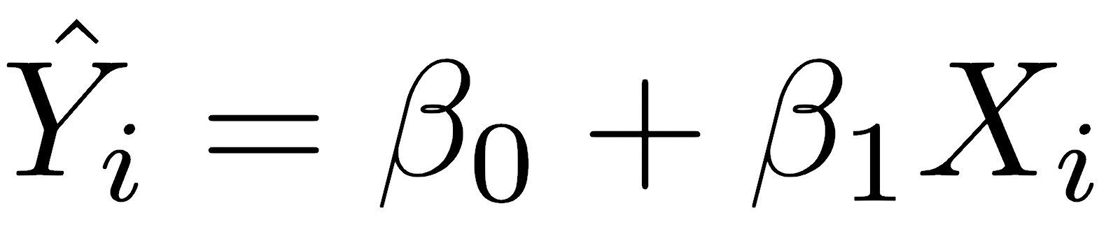
Least-squares is the most common regression method and the only method in many statistical programs. It is so common that many scientists are unaware that other methods exist. The linear mathematical model for the relationship between two variables, an independent X variable and a dependent Y variable, is described by the equation:

where β0 is the y-intercept and β1 is the slope. The value of any observed Yi equals the slope multiplied by the value of Xi plus the y-intercept, plus an error term εi. The error term represents factors other than X that influence the value of Y, including other unmeasured variables and measurement errors. Error in X is assumed to be minor, meaning that you set X and measure the resulting Y; in other words, the X variable is under your direct control, but the Y variable is not.
The least-squares method fits a line that minimizes the sum of squares of the residuals. Residuals are the differences between the observed values of Yi and the predicted Ŷi, which are predicted from Xi and the regression coefficients. For that reason, it is named least-squares regression.
The least-squares regression can be used for description, prediction, estimation, and hypothesis testing.
The slope of a least-squares regression can be calculated in three equivalent ways:
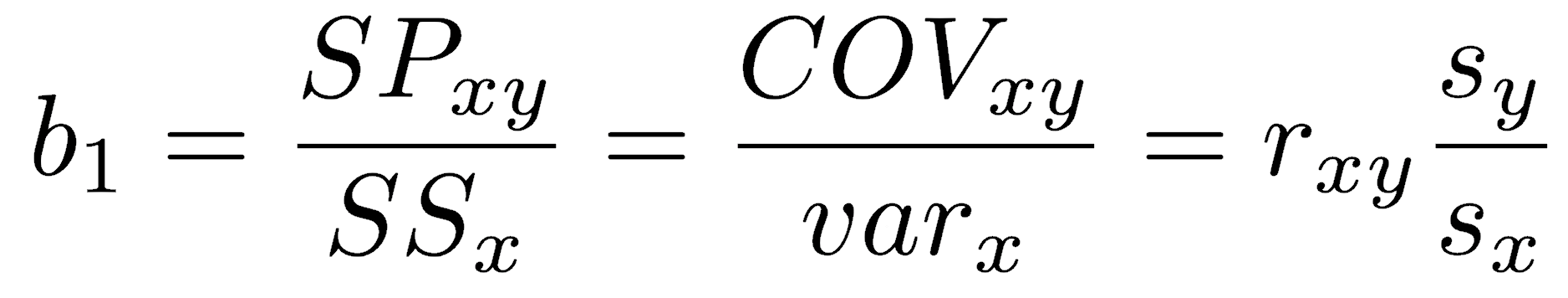
Depending on your circumstances, you may wish to calculate it as the sum of products divided by the sum of squares in x, the covariance divided by the variance in x, or the Pearson correlation coefficient multiplied by the ratio of standard deviations.
The regression line is constrained to pass through the centroid of the data, defined as the point located at the mean of X and the mean of Y. The y-intercept of a least-squares regression is calculated as:

Everything to this point is descriptive in that the statistics for slope and intercept are calculated, but no inferences are made about the population. If you wish to make statistical inferences about the parameters (the slope and intercept of the population), there are several questions you could ask, such as:
- What is the uncertainty in the slope estimate? Is the slope significantly different from zero?
- What is the uncertainty in the y-intercept estimate? Is the y-intercept significantly different from zero?
- How much variance in Y does the regression explain?
The ordinary least-squares method makes six (or seven, depending on what you do with the results) assumptions. Before using the regression results, you must ensure all these model assumptions are valid for your data.
- The individual errors must be uncorrelated with one another; that is, the value of one error term cannot be predicted from the term before it. For example, successive errors should not show a cyclical pattern.
- The errors must be normally distributed. This assumption is not required if you only need the coefficients of the regression, so it is, in a sense, optional. However, in practice, we always calculate a confidence interval or generate a p-value; if we do, the errors must be normally distributed. We will learn how to handle cases when errors are not normally distributed when we cover generalized linear models later in the course.
- The mean of the errors must be zero; that is, the mean of the errors lies on the regression line. This can be violated if a line is the wrong model for the data, such as when a parabola better describes the data, for example.
- The errors must be homoscedastic, that is, the variance of the errors should not change along the regression line. For example, a common violation is that the error variance increases along the regression line, shown by increasing scatter to the right.
- The errors must be uncorrelated with any of the independent variables.
- The model must be in linear form, that is, the model consists of a sum of independent variables multiplied by a parameter (the coefficients or slopes that you are trying to find) plus a constant intercept.
- Finally, if there is more than one independent variable (as we will see when we get to multiple regression), none of the independent variables can be a perfect linear function of another independent variable.
Once we perform a regression, we will be able to check three of these assumptions:
- Whether the relationship between X and Y is linear, or whether another function better describes it.
- Whether the residuals are normally distributed.
- Whether the residuals are independent of X or change systematically with X. Specifically, we want to check whether the scatter around the line increases as X gets larger.
Least-squares regression in R
You can perform a least-squares regression in R with the lm() function (short for linear model). The lm() function is exceptionally powerful. For now, we will consider only a simple linear regression of two variables.
So that we know the population parameters (slope and intercept), we will use simulated data for the demonstration. We specify a slope of 2.15 and a y-intercept of 4.64, then generate 30 points conforming to that relationship. These points have normally distributed errors around that line. Knowing these parameters will help us see that least-squares regression works.
slope <- 2.15 intercept <- 4.64 x <- rnorm(n=30, mean=15, sd=3) errors <- rnorm(n=30, sd=2) y <- slope*x + intercept + errors
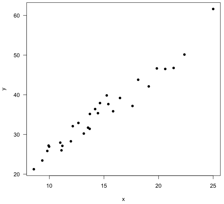
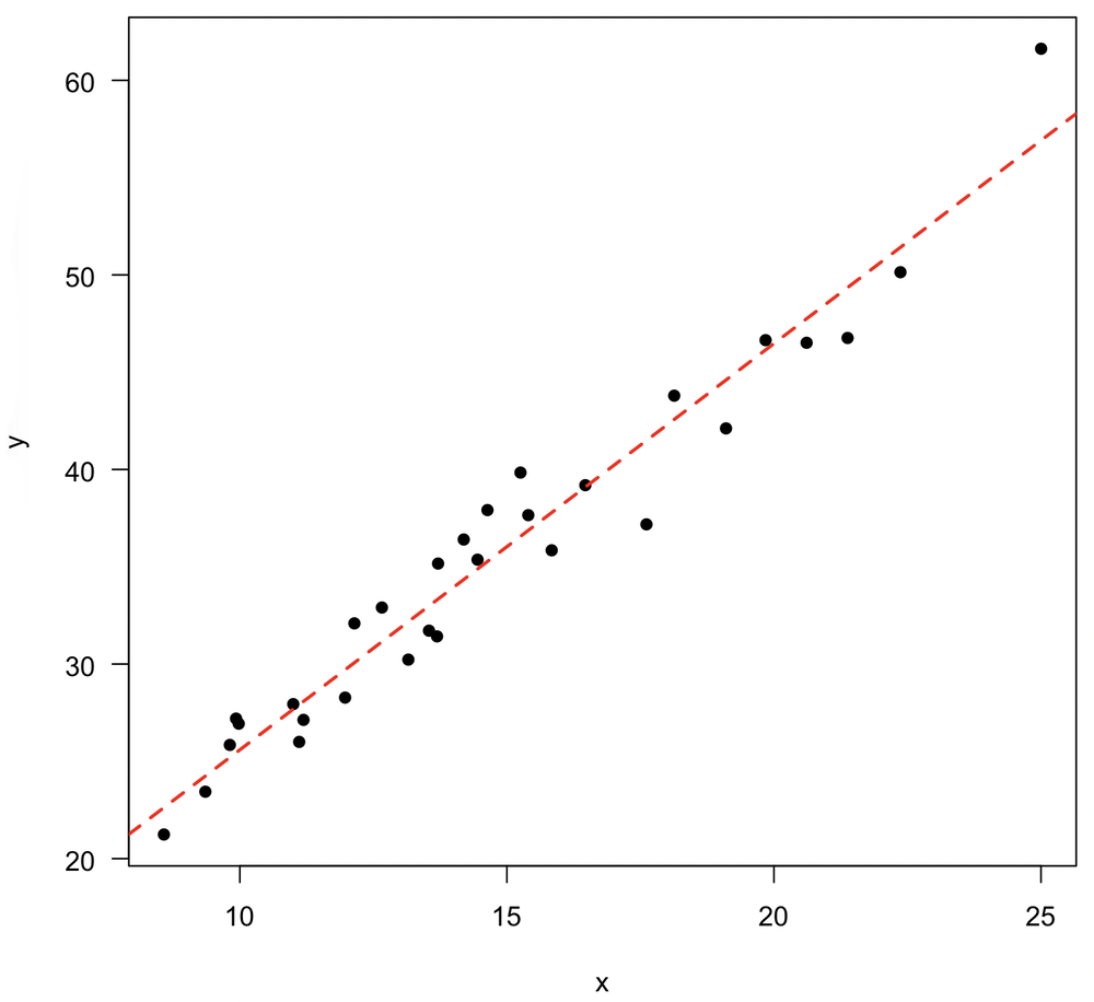
As always, we start by plotting the data to check that the relationship looks linear and that there are no outliers in either x or y. Note that because this is a simulation, your plot and your calculated regression will be slightly different than this.
plot(x, y, pch=16, las=1)
Next, we run the regression with the lm() function. In this example, y is modeled as a linear function of x. The regression results are assigned to an object (reg) so we can fully analyze the results and add the regression to a plot.
reg <- lm(y ~ x)
Read the notation lm(y~x) as “a linear model, with y as a function of x”. Other relationships can be modeled besides a simple linear one. For example, if you wanted y as a function of x2, you could write lm(y~x^2). Many other relationships are possible.
The reg object contains the estimates for the y-intercept (labeled Intercept) and slope, labeled for whatever the predictor variable is named (here, x).
> reg Call: lm(formula = y ~ x) Coefficients: (Intercept) x 4.711 2.088
Use the names() function to view everything contained in the reg object. You can access any of these by name or by position in the vector. For example, you could use reg$residuals or reg[2] to retrieve the residuals. Calling by name is safer and more self-explanatory, and it is worth the price of taking longer to type.
> names(reg) [1] "coefficients" "residuals" "effects" "rank" [5] "fitted.values" "assign" "qr" "df.residual" [9] "xlevels" "call" "terms" "model"
Confidence intervals
Confidence intervals on the slope and intercept are obtained with the confint() function, which produces an easily understandable result:.
> confint(reg) 2.5 % 97.5 % (Intercept) 1.857680 7.564935 x 1.901588 2.274428
These values are provided in a 2x2 matrix; assigning this to an object makes it easy to use row-column notation to extract the desired value. A different confidence level can be obtained with the level argument.
confint(reg, level=0.99)
Hypothesis tests
Hypothesis tests on the slope, intercept, and regression are obtained with the summary() function, again called on the regression object.
> summary(reg) Call: lm(formula = y ~ x) Residuals: Min 1Q Median 3Q Max -4.3073 -1.4186 0.1786 1.6621 4.7068 Coefficients: Estimate Std. Error t value Pr(>|t|) (Intercept) 4.71131 1.39310 3.382 0.00214 ** x 2.08801 0.09101 22.943 < 2e-16 *** --- Signif. codes: 0 *** 0.001 ** 0.01 * 0.05 . 0.1 1 Residual standard error: 2.063 on 28 degrees of freedom Multiple R-squared: 0.9495, Adjusted R-squared: 0.9477 F-statistic: 526.4 on 1 and 28 DF, p-value: < 2.2e-16
The output has a lot of information, so let’s step through this. The first lines display the function call.
Residuals are shown in the next block. This summary lets you evaluate several assumptions. Since the errors are assumed to be centered on the regression line, the median residual should be close to zero. Because the errors are assumed to be normally distributed, the first quartile (1Q) and third quartile (3Q) residuals should be approximately equally distant from zero. Likewise, the minimum (Min) and maximum (Max) residuals should be roughly equally distant from zero, although they will be more subject to outliers. In this case, everything looks roughly balanced.
The regression coefficients are shown next, along with tests of the null hypotheses (i.e., slope and intercept are zero). The estimates of the intercept and slope are shown in the second column (here, 4.71 and 2.09, close to the parameter values of 4.64 and 2.15), matching what was provided by displaying the regression object. The labeling of slope as x may seem confusing at first, but in multiple regression, where you regress one dependent variable (y) against multiple independent variables, such as Iron, Chloride, and Phosphorous, the slope for each independent variable will appear on its own line, labeled with its name.
Both the intercept and the slope follow a t-distribution, provided that there is random sampling and the errors are normally distributed. To run a t-test against null hypotheses of zero intercept and zero slope, you need the standard errors of the intercept and slope (third column) to calculate a t-statistic (fourth column). The corresponding p-values are shown in the last column. As R commonly does, these are tagged with asterisks to indicate their statistical significance, with *** indicating significance at the 0.001 level, ** indicating significance at the 0.01 level, * indicating significance at the 0.05 level, . indicating significance at the 0.1 level, and no symbol indicating significance at greater than 0.1.
The residual standard error is shown on the next line. The standard error of the residuals is calculated as the square root of the sum of squares of the residuals, divided by the degrees of freedom (n-2). The residual standard error measures the amount of scatter around the line. You can compare this value to the standard deviation in y to get a sense of the amount of variation in y that is not accounted for by the regression. For example, a strong linear relationship would have a much larger standard deviation in y than a residual standard error, indicating that most of the variation in y is related to the variation in x. In a perfect fit, the residual standard error would be zero, as all points would lie exactly on the line and all residuals would be zero.
The R-squared value indicates the proportion of explained variation, that is, the variation in y that is explained by the variation in x. This is also called the coefficient of determination. For a simple linear regression, it is equal to the square of the correlation coefficient. If all y-values fell exactly on the regression line, x would be a perfect predictor of y, and x would be said to explain all of the variation in y. If the points formed a nearly circular shotgun blast with a correlation coefficient near zero, the percent of explained variation (R2) would be close to zero, indicating that the regression explains almost nothing about the variation in y. R2 is an important statistic and should always be reported; it is the best single number to describe a linear relationship’s strength.
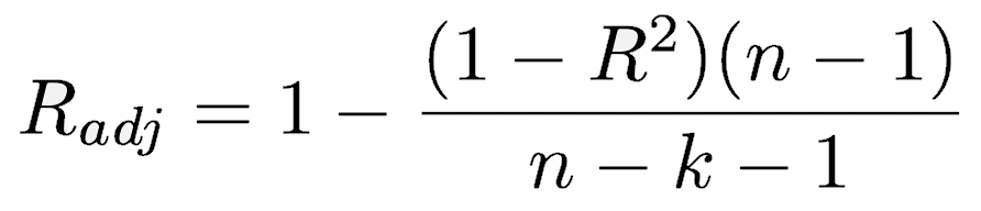
The adjusted R-squared reflects a small penalty correction for the number of independent variables (k) used in the regression. As you add more independent variables, the adjusted R-squared will become progressively smaller than the R2 value. When R2 is near zero, the adjusted R2 can be negative, unlike the square of Pearson’s correlation coefficient, which is never negative.
The test of the significance of the regression itself is shown on the last line as an F-test, a ratio of variances. This tests whether the variance accounted for by the regression exceeds the variance in the residuals. If the regression explains none of the variation in Y, these two variances should be equal. The low p-value in this example indicates that the regression variance is greater than the residual variance. The degrees of freedom are 1 for the numerator (the regression) and 28 (n-2) for the denominator. Remember that this F-test will tell you only whether there is a statistically significant result. Like all p-values, it is strongly influenced by sample size and tells you nothing about effect size and our uncertainty in it. To determine effect size, examine the size of the slope and its uncertainty, given by a confidence interval.
Evaluating the assumptions
Before using the results, you should evaluate the regression assumptions with the plot() command called on the regression object. This presents four useful plots, which can be shown all at once by setting the mfrow argument to par():
par(mfrow=c(2, 2)) plot(reg)
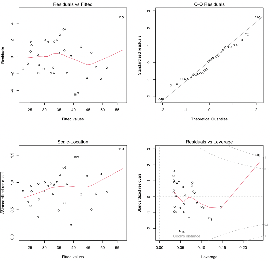
The first plot (upper left) shows residuals (ε) against the fitted values (Ŷ). Two aspects are critical. First, the residuals should be centered around zero (shown by the gray dashed line) for all fitted values; the red line showing the trend of the residuals should be close to the gray dashed line. Some fluctuation in the red line is normal, especially for small data sets, and isn’t cause for concern. Second, the variance of the residuals should not change with fitted values: the cloud of points should not widen to the left or to the right.
Three points marking the three largest residuals will be identified (2, 11, and 18 in this example); the number corresponds to the row of the data frame. Watch for the numbered points in all four plots to identify outliers. These might indicate data-recording or acquisition errors, such as an erratic reading from an instrument. Points that reflect such errors need to be corrected or removed from the regression. However, never remove points simply because that would clean up a regression.
The second plot (upper right) is a quantile-quantile plot. Because the regression assumes that the residuals are normally distributed, inspect this plot to verify that the points fall close to a line, indicating good agreement between the theoretical and observed quantiles. This match should be especially good in the middle part of the range, as it is common for points near the ends of the range to lie off the dashed line. Strong systematic departures indicate non-normally distributed errors.
The third plot (bottom left) focuses on trends in the sizes of the residuals. The square root of the absolute value of the residuals is plotted, which allows one to see trends in the size of the residuals with the fitted values. The residuals should show no trend (i.e., the red line should be relatively flat), and the residuals should not form a triangular region, with an increasing range in the size of residuals as the fitted values increase. Note that the red line tends to rise in this example, even though no trend in residuals was simulated; again, small fluctuations or departures are not necessarily cause for concern.
The fourth plot (bottom right) plots standardized residuals against leverage, giving insight as to which data points have the greatest influence on slope and intercept estimates. Note that this is a different plot than indicated in the Crawley text (p. 144), but the goal is the same. Standardized residuals should show no trend with leverage (i.e., the solid red line should lie close to the dotted gray line). Furthermore, no points should have large values of Cook’s distance; large values indicate that an outlier (a point with a large residual) also has strong leverage (the ability to pull the regression line in some direction). In this case, we see that a single data point (#11) has a large residual and a large leverage, thereby exerting substantial control on the regression. Note that point 11 was unusual in plots 1 and 3 as well; on the scatterplot, point #11 is in the upper right corner.
Adding the regression to a plot
While our plot is still active, you can add the regression line to it with the abline() function. You can stylize the line as you normally would by changing its color, line weight, or line type.
plot(x, y, pch=16) abline(reg, col="red", lwd=2, lty="dashed")
Prediction using the regression
You can use a least-squares regression for prediction: if you know the independent (predictor) variable, you can predict the expected value of the unknown dependent (result) variable. To do this, use the predict() function with the regression object and a vector of values of the independent variable.
> predict(reg, list(x=c(12.2, 13.7, 14.4))) 1 2 3 30.18501 33.31702 34.77862
You will generally want to express uncertainties with these estimates, which is done with the interval argument. There are two types of uncertainties. The first reflects the uncertainty associated with estimating the mean at a particular X value, which is done by setting interval="confidence". The second reflects the uncertainty in predicting a single value, which is made by setting interval="prediction". The prediction interval for a single value can be substantially larger than the confidence interval around a mean. This is especially so as the sample size increases, which causes the confidence interval around the mean to shrink substantially.
> predict(reg, list(x=c(12.2, 13.7, 14.4)), interval="confidence") fit lwr upr 1 30.18501 29.28002 31.09000 2 33.31702 32.52162 34.11241 3 34.77862 34.00454 35.55271
> predict(reg, list(x=c(12.2, 13.7, 14.4)), interval="prediction") fit lwr upr 1 30.18501 25.86337 34.50664 2 33.31702 29.01700 37.61704 3 34.77862 30.48249 39.07475
Model 2 regression
In a model 1 regression, you control the independent variable (x) and measure the dependent (response) variable (y). Lab experiments are examples of this. In other situations, you do not control either variable, such as if you measured the lengths and widths of clams you found in a river. In these cases, it is not clear which variable would be considered the independent (x) or dependent (y) variable. The order matters because a regression of y on x produces a different line than a regression of x on y. When you do not control one of the variables, both variables are said to have measurement error, and you must perform a model 2 regression. Model 2 regressions allow us to describe the relationship, generate confidence intervals, and test some hypotheses, but they cannot be used for prediction.
A model 2 regression accounts for the uncertainty in both x and y by minimizing the errors in both directions. There are several ways to do this. In a major axis regression, what is minimized is the perpendicular distance from a point to the line. In standard major axis (SMA) regression (also called reduced major axis or RMA regression), the areas of the triangles formed by the observations and the regression line are minimized. The standard major axis regression is particularly common. The slope of an SMA regression is:
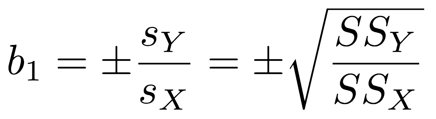
The sign is listed as plus or minus because it is set to match the sign of the correlation coefficient. The slope can be calculated as the ratio of the standard deviations or as the square root of the ratio of the sum of squares, whichever is more convenient.
The SMA y-intercept is calculated as it is for the least-squares regression; that is, the line must pass through the centroid.
Functions for the SMA slope and intercept are straightforward. Note that the sign of the slope is made to match that of the correlation coefficient with the ifelse() function.
smaSlope <- function(x, y) { sign <- ifelse(cor(x, y) >= 0, 1, -1) b1 <- sign * sd(y) / sd(x) return(b1) } smaIntercept <- function(x, y) { b1 <- smaSlope(x, y) b0 <- mean(y) - mean(x) * b1 return(b0) }
The SMA slope equals the least-squares slope divided by the correlation coefficient and is therefore always steeper than a least-squares slope. The difference in these two slopes decreases as the correlation becomes stronger. As the correlation between two variables weakens, the slope of an SMA regression approaches 1.0, whereas it approaches 0 in a least-squares regression.
Standard errors are available for the SMA slope and intercept (Kermack and Haldane 1950, Miller and Kahn 1962, and see acknowledgments below). From these, you can calculate confidence intervals on the slope and intercept, using n-2 degrees of freedom. See the end of the means lecture for instructions on how to do this.
The lmodel2 package can run various model 2 regressions, plot them, calculate confidence intervals, and perform statistical tests. After loading that library, running vignette("mod2user") will display an excellent PDF on best practices, particularly the appropriate circumstances for each type of model 2 regression. If you need a model 2 regression, read this vignette.
Adding a trend line to a plot
Sometimes, you may wish to add a trend line through the data solely to describe any trends that are not described by any particular function.
You can show how these could be used for a plot of temperature versus day of the year, which displays a sinusoidal relationship. For this, use the UsingR library that accompanies the Crawley textbook.
library(UsingR) attach(five.yr.temperature)
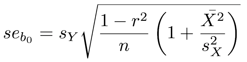
The function scatter.smooth() plots the data and the trend line in one step. The col parameter sets the color of the data points.
scatter.smooth(temps ~ days, col="gray")

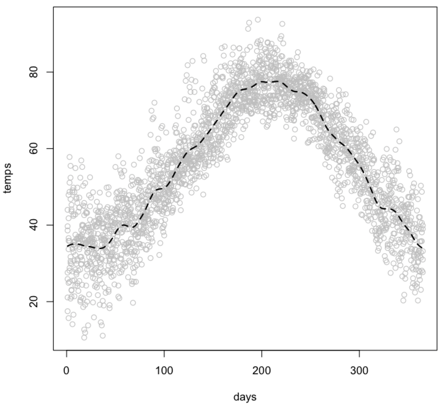
You can add a trend line to an existing plot in two ways. The first uses the smooth.spline() function to calculate the trend line and the lines() function to add it to the plot. You can use the lty parameter to dash the trend line and the lwd parameter to bold it.
plot(days, temps, col="gray") lines(smooth.spline(temps ~ days), lty=2, lwd=2)
You can use the supsmu() function to make a Friedman’s SuperSmoother trend line, and again display it with the lines() function. Note that the syntax for calling supsmu() differs from that of smooth.spline() or performing a regression.
plot(days, temps, col="gray") lines(supsmu(days, temps), lty=3, lwd=2)
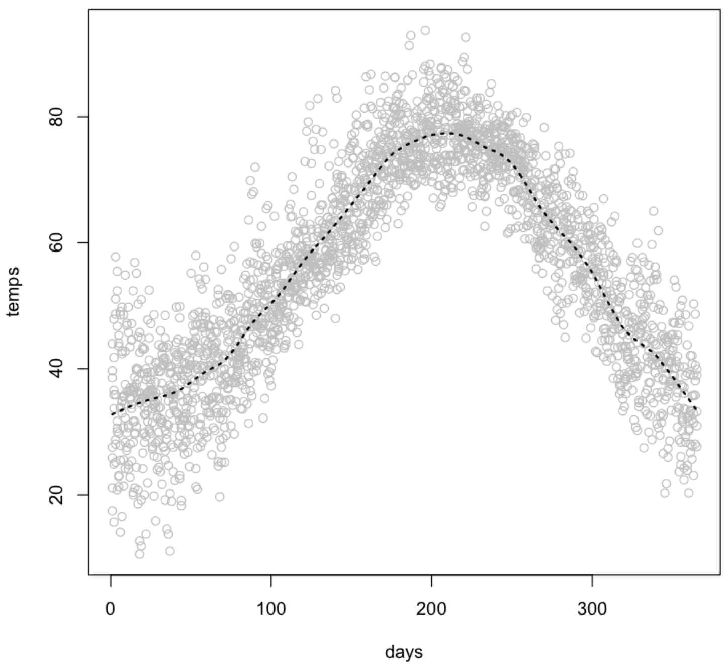
You can show all three trend lines on one plot for comparison. The default scatter.smooth() function produces the smoothest trend line of the three. You can control the smoothness of any of these trend lines by adjusting one of their parameters. See the help pages for more details, in particular the span parameter for scatter.smooth(), the spar parameter for smooth.spline(), and the bass parameter for supsmu().
scatter.smooth(temps ~ days, col="gray") lines(supsmu(days, temps), lty=3, lwd=2) lines(smooth.spline(temps ~ days), lty=2, lwd=2) legend(locator(1), lty=c(1, 2, 3), lwd=c(1, 2, 2), legend=c("scatter.smooth", "smooth.spline", "supsmu"))
The last line of this code adds a key with the legend() function. In it, you specify the types of lines (lty), their weight (lwd), and their labels (legend). The locator(1) function lets you click where you want the upper left corner of the legend box to be placed on your plot. Alternatively, you could instead specify the (X, Y) coordinates of the upper left corner - see the help page for legend() for instructions. The legend() function can be used on any plot with different types of points.
Acknowledgments
David Goodwin kindly brought to my attention an error in Davis (1986, 2002) for the equation of the standard error of the intercept in an SMA regression, and the correct equation is shown on this page. Davis did not include the final term in the radicand, but it should be, as is shown. The correct equation is given in Kermack and Haldane (1950) and Miller and Kahn (1962), both cited by Davis. The correctness of the Kermack and Haldane (1950) equation over the Davis (1986, 2002) version can be demonstrated with a bootstrap.
References
Davis, J.C., 1986. Statistics and Data Analysis in Geology, 2nd edition. Wiley: New York.
Davis, J.C., 2002. Statistics and Data Analysis in Geology, 3rd edition. Wiley: New York, 638 p.
Kermack, K.A., and J.B.S. Haldane, 1950. Organic correlation and allometry. Biometrika 37:30–41.
Miller, R.L., and J.S. Kahn, 1962. Statistical Analysis in the Geological Sciences. Wiley: New York, 483 p.
