Coloring points
2 December 2021, updated 14 December 2023
On scatterplots, you might want to color-code the points by a continuous variable. For example, suppose you had a plot of salinity versus longitude and latitude. Longitude and latitude would be the x and y axes of the plot, and you might want to color the points based on the salinity value. You might group salinity into bins and plot each individually, but the code would be long and complicated, and by grouping values, you lose information. A better way is to have the color reflect the actual value of salinity. I’ll show a simple way to do this in three examples. The last approach is the most flexible.
Data
First, I’ll simulate a data set with values of x, y, and z.
x <- rnorm(50) y <- runif(50) z <- 3.2 * x + rnorm(50, sd=0.5)
We will plot y vs. x and use the third variable (z) to control the color of the points. To do this, we must create a version of z that ranges between 0 (corresponding to the minimum value of z) and 1 (the maximum value). This is called a range transformation.
zScaled <- (max(z) - z) / (max(z) - min(z))
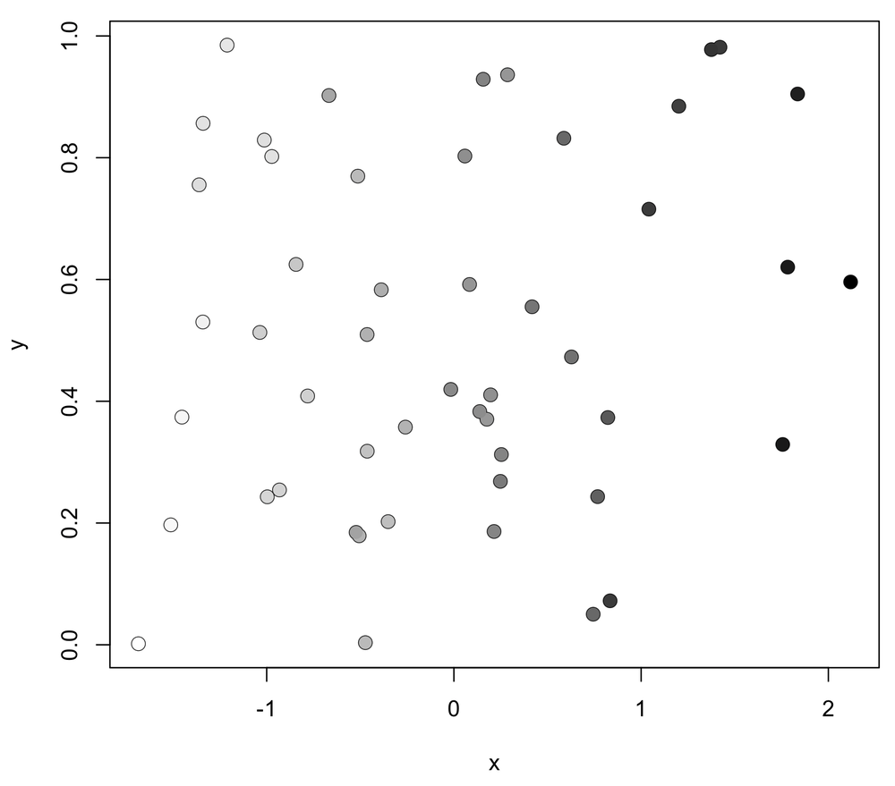
Plot version 1: grayscale
The first example will plot the points on a grayscale. It is simple: just set the col argument to use the gray() function on the values of zScaled.
plot(x, y, cex=1.3) points(x, y, pch=16, cex=1.3, col=gray(zScaled))
Note that we take the unusual step of not setting type="n" in the plot() call because the black outlines it produces help identify light gray points that could be hard to detect against the white background.
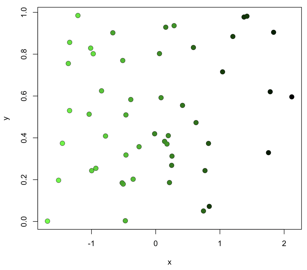
Plot version 2: color
We can plot colored points by using the rgb() command and setting the red, blue, and green values, which range from 0 (no color) to 1 (full color). The last value is alpha, which sets the opacity, with 0 being completely transparent and 1 completely opaque. In this example, we turn off red and blue by setting their values to zero, we set green by the value of zScaled, and we set alpha (the transparency) to 1 (fully opaque). You can be creative with these values to get any color you want.
plot(x, y, cex=1.3) points(x, y, pch=16, cex=1.3, col=rgb(red=0, green=zScaled, blue=0, alpha=1))
Setting type="n" in plot() will remove the black outlines from the points if you want. Keeping it helps pale colors from disappearing against the white background.
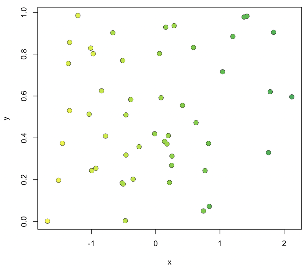
Plot version 3: color gradient
We can also allow for a gradient between any two colors using this colorScaler() function. The function requires a numerical vector of the data (x). It also optionally accepts values for the colors corresponding to the smallest value in the data (lowColor) and the largest (highColor). By default, these colors are pale gray and black. By working with our data directly, it saves us the step of calculating zScaled.
colorScaler <- function(x, lowColor=gray(0.9), highColor=gray(0.0)) { rgbLow <- col2rgb(lowColor) rgbHigh <- col2rgb(highColor) zeroOne <- (x - min(x)) / (max(x) - min(x)) xColors <- vector(mode="character", length=length(x)) for (i in 1:length(x)) { red <- zeroOne[i] * (rgbHigh[1] - rgbLow[1]) + rgbLow[1] green <- zeroOne[i] * (rgbHigh[2] - rgbLow[2]) + rgbLow[2] blue <- zeroOne[i] * (rgbHigh[3] - rgbLow[3]) + rgbLow[3] xColors[i] <- rgb(red, green, blue, maxColorValue=255) } xColors }
The plot is made like this:
plot(x, y, cex=1.3) points(x, y, pch=16, cex=1.3, col=colorScaler(z, lowColor="#F4F906", highColor="#00ac55"))
This example uses web-specified colors, but any color can be used, including named colors or values from gray(). The black outlines can be removed by setting type="n" in plot().
Tips on using colors
There are many sources of advice on how to choose colors effectively. Here are two links that I like:
Natalya Shelburne’s Practical Color Theory for People Who Code.
Kenneth Moreland’s Diverging Color Maps for Scientific Visualization. This one is great for options for avoiding the ineffective rainbow spectrum.
