Making maps in R
16 March 2023
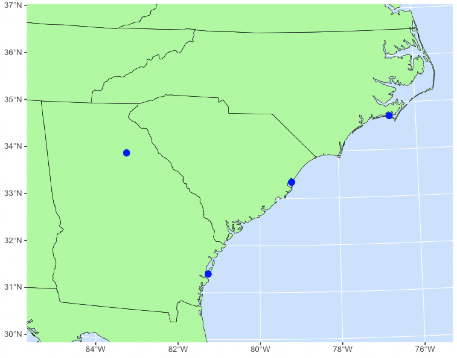
One common task we face is plotting points on a map, which involves plotting a base map and then adding points to it. It can be tricky to get both plotted correctly, particularly if the map uses a custom projection. This tutorial shows you how, using a map of Georgia, South Carolina, and North Carolina. Here is the finished map:
The map projection will be needed at two places in the code, so we will start with that. If we do not specify a projection, boxes of latitude and longitude will appear as rectangles. If the map spans a large area, countries and states will appear to have the wrong shape — they’ll look too wide towards the poles and too narrow towards the equator. To fix this, we use an equal-area projection, such as the Albers. The projection is defined by a string following this format:
crsCarolina <- "+proj=laea +lat_0=34 +lon_0=-80.5"
The laea defines this as an Albers Equal-Area Projection, and lat_0 and lon_0 define the latitude and longitude of the approximate center (in degrees) of the map area. Centering the projection on the map area ensures that the map doesn’t look tilted and that the shapes of the regions look correct. This string is called a coordinate reference system (crs), so it will be helpful to begin the name of this object with crs.
To make plotting the map easier, we will use the sf package, which stands for Simple Features. This package simplifies plotting points, lines, polygons, etc. on maps.
library(sf)
You will likely have a dataframe that has the latitude and longitude of the points you want to plot; it may also include additional columns with other attributes of the locations. To plot these locations, we need to convert the dataframe to an sf object using the st_as_sf() function. For this demonstration, I’ll make a data frame containing only latitude and longitude columns, then convert it to an sf object.
myPoints <- data.frame(latitude=c(33.9486, 31.39764, 33.3502, 34.7173), longitude=c(-83.3757, -81.2801, -79.1950, -76.6720)) myPointsSF <- st_as_sf(myPoints, coords=c("longitude", "latitude"), crs=4326)
The coords argument to st_as_sf() states which columns in our data frame contain the position data. Specify the longitude column first, then the latitude. The crs=4326 argument states that these locations use the WGS84 GPS coordinate system.
We must transform the coordinates of our points to the projection system we will use on our map, using the st_transform() function.
myPointsSF <- st_transform(myPointsSF, crs=crsCarolina)
Next, we need a basemap that shows state borders, and for that we use the naturalearth and naturalearthdata packages.
library(rnaturalearth) library(rnaturalearthdata)
The naturalearth package has methods for getting a variety of features, such as the borders of countries and states, coastlines, rivers, lakes, and much more. With the ne_states() function (that’s naturalearth states, not northeast states), we extract state borders for the United States.
america <- ne_states(iso_a2="US", returnclass="sf")
These state borders must also be transformed to our map projection, following the same approach we used for the points.
americaSF <- st_transform(america, crs=crsCarolina)
Now we are ready to make the map, using the ggplot() function from the versatile ggplot2 library. Calls to ggplot() consist of a series of statements separated by a + sign. If you haven’t used ggplot() before, the syntax can look strange, but you will quickly realize that it describes how we think of making a map: draw a base map AND add our points AND color the background, etc. Here is the full command for making our map:
ggplot(data=americaSF) + geom_sf(color="black", fill="palegreen") + geom_sf(data=myPointsSF, color="blue", size=3) + coord_sf(xlim=c(-500000, 500000), ylim=c(-450000, 350000), expand=FALSE) + theme(panel.background= element_rect(fill="slategray1"))
Let’s break down these five lines. The first line says that we will use the americaSF base map. The second line says to draw the map using the geom_sf() function, with state outlines in black and filling the states with the palegreen color. The third line draws the points as filled circles (the default), in blue and tripled in size. The fourth line specifies the region that is shown on the map, that is, what portion of the map of the United States to show; I’ll say more about the xlim and ylim values below. The fifth line specifies the background color of the map; for this map, the effect is to make the ocean color be slategray1.
The most laborious part of making the map is finding the correct values of xlim and ylim to pass to coord_sf(). Unfortunately, these must be found through trial and error, but it will likely take only a few minutes.
A good starting strategy is to pick relatively large values, say, plus or minus one million. I am uncertain what these values mean in the physical world; they may be just arbitrary coordinates for the plot specific to the crs (coordinate reference system) that is being used. The map will be centered on the spot that you chose when you defined the crs, so the values of xlim will describe how far the map extends to the east and to the west of the crs center, and the values of ylim describe how far the map extends to the south and the north of the crs center.
Once you have this first map, see if you need to extend or shrink the map relative to its center, and adjust the lower and upper values of xlim and ylim accordingly. Make large changes early and progressively smaller changes as you continue to refine the map area. By doing this, I can usually get the map area set in fewer than ten tries.
Here is all the code for the map in one block:
library(sf) library(rnaturalearth) library(rnaturalearthdata) library(ggplot2) crsCarolina <- "+proj=laea +lat_0=34 +lon_0=-80.5" myPoints <- data.frame(latitude=c(33.9486, 31.39764, 33.3502, 34.7173), longitude=c(-83.3757, -81.2801, -79.1950, -76.6720)) myPointsSF <- st_as_sf(myPoints, coords=c("longitude", "latitude"), crs=4326) myPointsSF <- st_transform(myPointsSF, crs=crsCarolina) america <- ne_states(iso_a2="US", returnclass="sf") americaSF <- st_transform(america, crs=crsCarolina) ggplot(data=americaSF) + geom_sf(color="black", fill="palegreen") + geom_sf(data=myPointsSF, color="blue", size=3) + coord_sf(xlim=c(-500000, 500000), ylim=c(-450000, 350000), expand=FALSE) + theme(panel.background=element_rect(fill="slategray1"))
Additional tutorials
There are many great tutorials out there on how to make maps in R. Often when I am trying to make a map, examples presented in them guide me to a solution, even if they don’t specifically answer my questions. Here are some of my favorite tutorials:
Mel Moreno and Mathieu Basille have a great tutorial on drawing beautiful maps with ggplot() and sf. Also, see their part 2 and part 3.
Eric Anderson has a good explanation of making maps with R, notable especially for its demonstration of the ggmap package, which simplifies getting base maps from Google and Open Street Maps. Also, be sure to check out Eric’s excellent Reproducible Research Course.
Edzer Pebesma has a good illustration of plotting simple features, and Ryan Garnett has made a handy cheatsheet for sf.
Duke University Libraries has a nice guide to projections and coordinate reference systems.
Milos Popovic demonstrates mapping rivers with sf and ggplot2.
Mapping resources
OpenTopography for Developers. Many types of global and USGS maps, including DEMs and other high-resolution topographic data sets.
