Ordination utilities
3 August 2025
Ordination is a powerful tool for revealing the ecological gradients that shape the distribution of species. Common and effective methods for this include non-metric multidimensional scaling (NMS, also known as NMDS, nMDS, MDS, etc.) and detrended correspondence analysis (DCA). Using these, however, is prone to several trouble spots, including issues with culling samples and taxa, verifying that the structure of the data sets is consistent, and making plots. Here, I introduce ordinationUtilities.R, a source file of useful functions for working with ecological ordinations.
The easiest way to explain what ordinationUtilities.R can do is to demonstrate it. I’ll do that with benthic invertebrates from the Upper Ordovician near Frankfort, Kentucky. These data are derived from Holland and Patzkowsky (2004).
Example data
I recommend structuring these types of data into three files. The first contains the abundance data, counts of the number of specimens or individuals of each species in each sample. Rows correspond to samples and columns correspond to species (taxa). The second contains the sample properties, which could be things like latitude, longitude, stratigraphic position, depositional environment, etc. Rows correspond to samples, and columns correspond to the various properties. The third contains the taxon properties, such as phylum, class, order, plus ecological characteristics like motility, tiering, and feeding strategy, anything that describes a taxon. Missing values in the two properties files should be coded as NA, not left blank or marked with some other indicator.
For this demonstration, I will use frankfortCounts.csv, frankfortSampleProperties.csv, and frankfortTaxonProperties.csv. These are read like this:
counts <- read.table("frankfortCounts.csv", header=TRUE, row.names=1, sep=",")
sampleProps <- read.table("frankfortSampleProperties.csv", header=TRUE, row.names=1, sep=",")
taxonProps <- read.table("frankfortTaxonProperties.csv", header=TRUE, row.names=1, sep=",")
Checking data structure
For the analyses, it is essential that the row names of the counts and the sample properties should be identical, that is, that there are the same number of samples in both, that they should be ordered the same, and that their names be identical. Likewise, the column names of the counts and the row names of the taxon properties should similarly match. ordinationUtilities.R has two simple functions for verifying all this.
To use ordinationUtilities.R, place it in your working directory and load it with the source() function:
source("ordinationUtilities.R")
Check the structure of your three data files with the commands checkTaxonNames() and checkSampleNames():
checkTaxonNames(counts, taxonProps)
checkSampleNames(counts, sampleProps)
If the names agree, you will get a message that the names match correctly. If not, you will get a warning message explaining the problem. Always fix these issues and re-run these commands until everything checks out; if you don’t, your analyses will be incorrect, often in ways that are not immediately apparent.
Culling the data
Rare taxa and depauperate samples (samples that contain few taxa) can distort relationships in an ordination, and it is best to remove these. You want to be gentle in what you consider rare or low diversity, because your dataset will shrink as these cutoffs become larger. Culling rare taxa can cause some samples to become depauperate, and vice versa, so the culling should alternate between taxa and samples until all taxa meet some minimum number of occurrences and all samples meet some minimum diversity (richness). This is done automatically with cullCounts():
countsCulled <- cullCounts(counts, minOccurrences=2, minDiversity=2)
In this example, any taxon that occurs two or more times, and any sample that contains at least two taxa, will be retained. In other words, this example removes singleton taxa and samples containing only one taxon, the minimum level of culling. When culling is finished, the function will report how many taxa and samples were removed, as well as the number of taxa and samples in the remaining data.
If any samples or taxa are removed when the counts are culled, the sample and taxon properties will no longer be in agreement. For example, the sample properties will include samples no longer in counts, and the taxon properties will include taxa no longer in counts. To keep these in sync with the counts data, use the cullProperties(), being sure to specify whether samples or taxa are being culled from the properties file:
samplePropsCulled <- cullProperties(sampleProps, countsCulled, "samples")
taxonPropsCulled <- cullProperties(taxonProps, countsCulled, "taxa")
cullProperties() will automatically run checkTaxonNames() and checkSampleNames() when it is finished to verify that the structure of the data remains intact.
Perform any data transformations
Ecological data generally needs transformations before ordinations. The first is to change simple counts within each row to a percent of the total for each row; in other words, to express the abundance of each taxon as a percentage of the sample. Doing this prevents the ordination from primarily reflecting sample size. The second is to put all species on the same weight, so that abundant species don’t control the ordination structure. This changes all values with each column (i.e, for each taxon) to range from 0 (the lowest percent abundance for that taxon) to 1 (the highest percent abundance for that taxon). After this second data transformation, every value will range from 0 to 1. Both transformations are made with the decostand() function in the vegan package, so that package must be loaded first:
library(vegan)
countsCulled.t1 <- decostand(countsCulled, method='total')
countsCulled.t2 <- decostand(countsCulled.t1, method='max')
In this notation, the t1 and t2 indicate the count data after the first and second data transformation. You can name these anything you want, but adding “culled”, “t1”, and “t2” helps you to easily keep track of the different versions of the data.
Ordinate the data
In this example, I will ordinate the data with DCA; NMS would be another good choice. Both types are performed with the vegan package. For convenience, it is good to extract the sample scores and species scores into objects that are clearly named. A quirk of DCA in R is that the scores must be converted to data frames. This is not necessary when extracting scores from NMS (see the NMS tutorial for extracting scores).
countsCulled.dca <- decorana(countsCulled.t2)
dcaSampleScores <- as.data.frame(countsCulled.dca$rproj)
dcaSpeciesScores <- as.data.frame(countsCulled.dca$cproj)
Plotting functions from ordinationUtilities.R
Plotting ordination results can be done with base-R, ggplot, and functions specific to DCA and NMS, but ordinationUtilities.R provides several methods for making common — and often complicated — plots easily.
Simple plots of species and sample scores
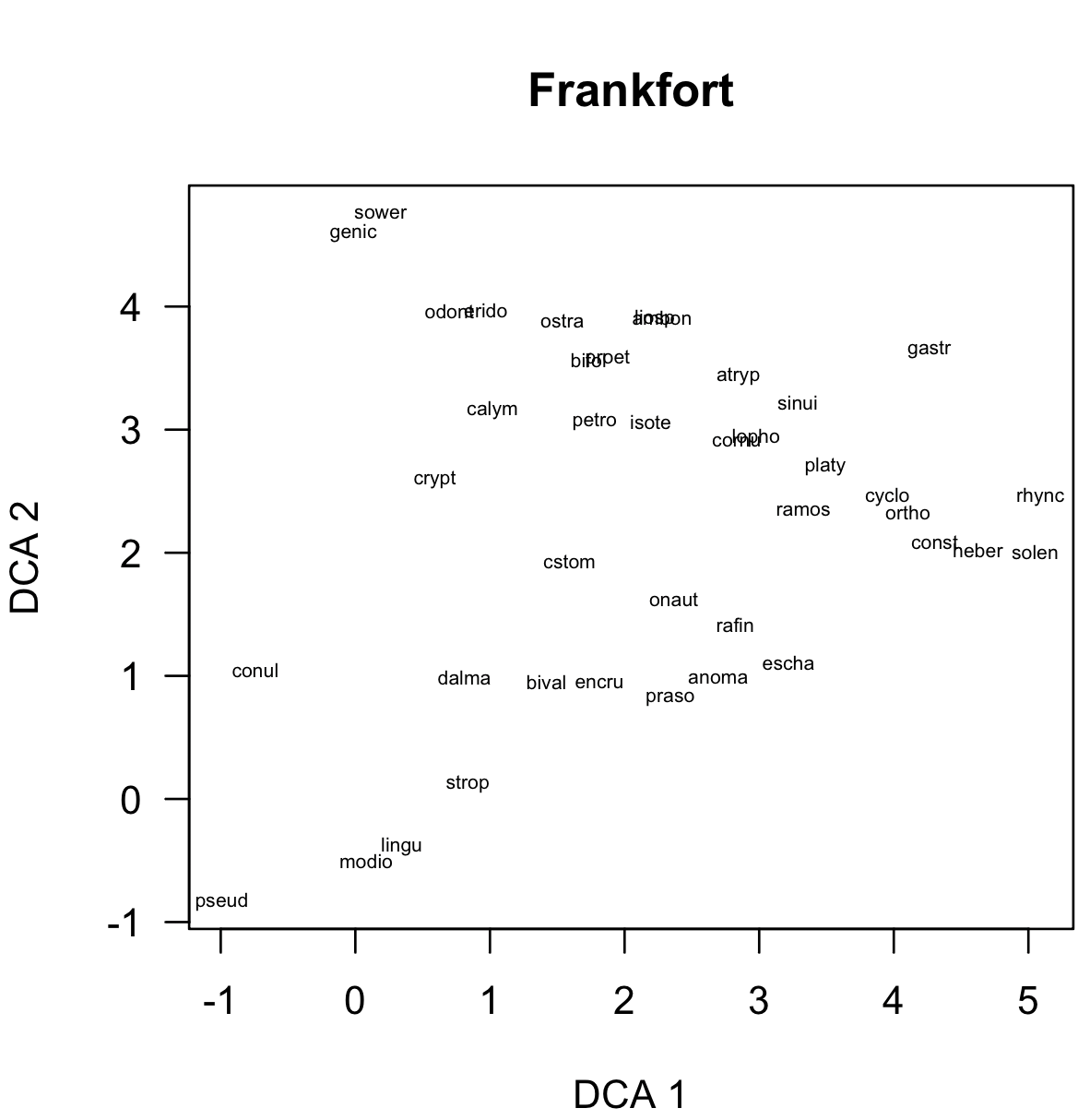
The first is a simple plot of species scores, done with scoresPlot():
scoresPlot(dcaSpeciesScores, showLabels=TRUE, main="Frankfort")
Note: click on any image to see it in more detail.
If showLabels is left as FALSE (the default), points will be shown instead of labels. Sample scores can also be plotted with scoresPlot(), and you can do other typical customizations, such as changing the main label or the type of points that are used.
scoresPlot(dcaSampleScores, pch=16)
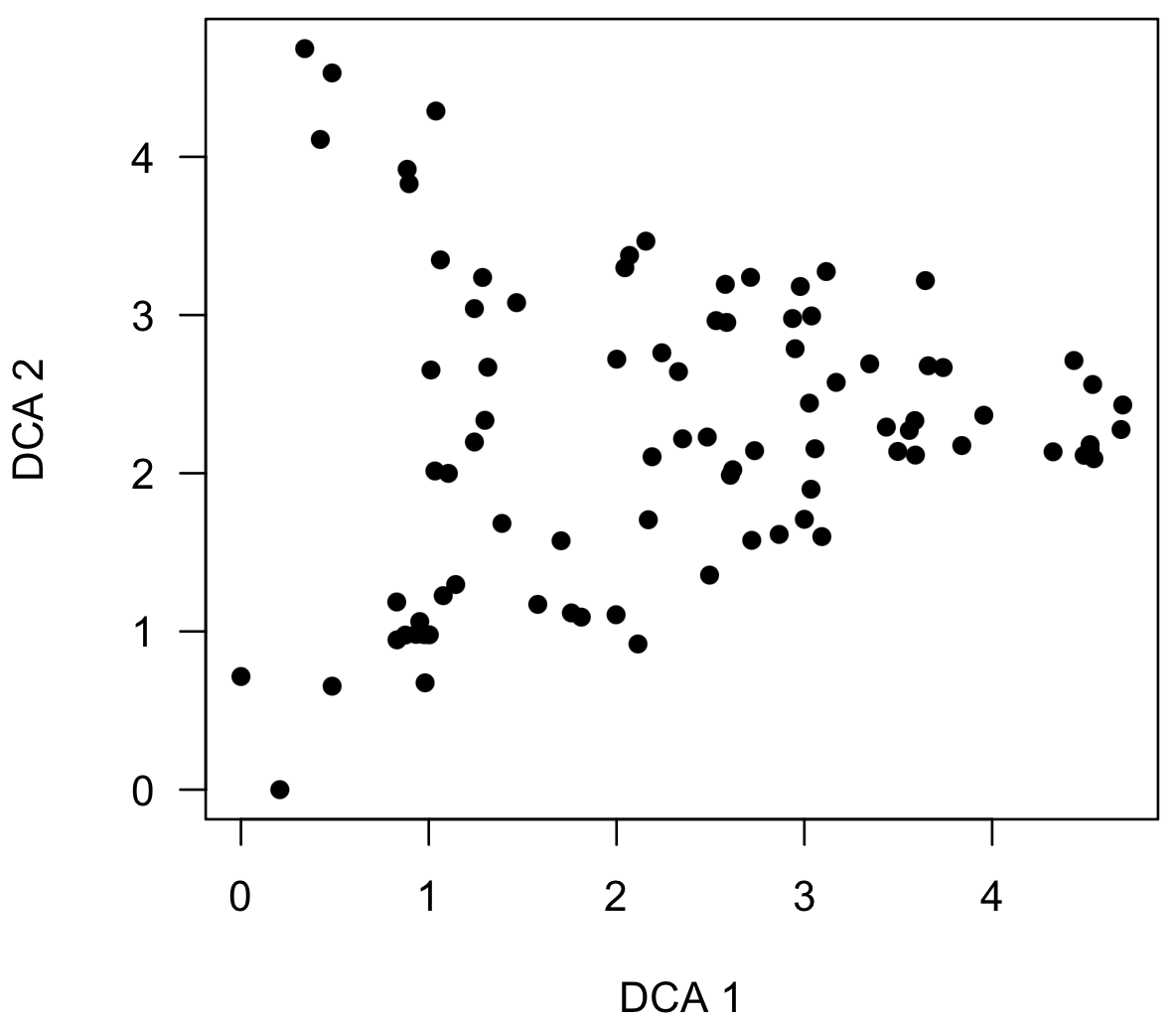
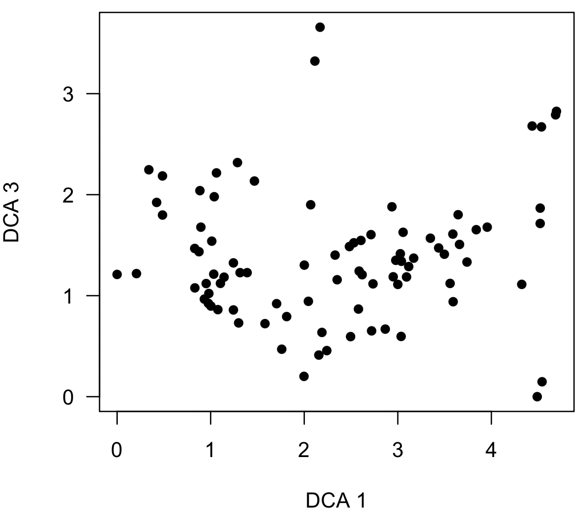
Note that this plot shows a triangular distribution of points similar to a known distortion in decorana, causing many to avoid using the method, even though NMS can produce a similar distortion (see Patzkowsky and Holland 2012). A triangular distribution is not necessarily a problem and can reflect true structure in the data, as it does here. If this distribution resulted from the DCA distortion, a plot of axis 3 vs. axis would be the mirror image, and this can be made by specifying the axes argument, which specifies the ordination axes to be shown on the x-axis and the y-axis.
scoresPlot(dcaSampleScores, pch=16, axes=c(1, 3))
Simple color-coded plots of scores
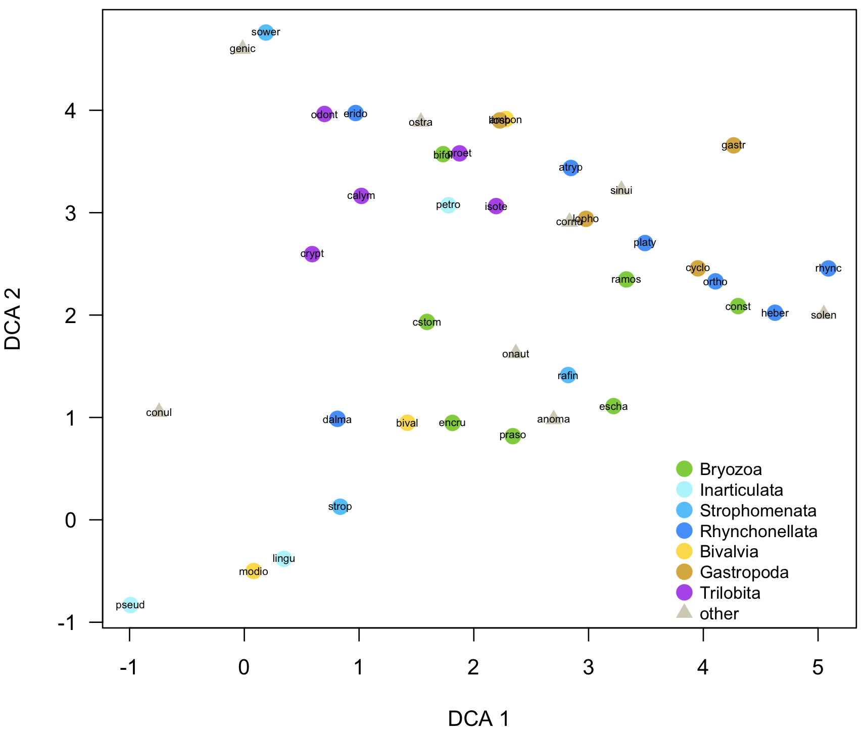
To interpret ordinations effectively, points need to be coded by external variables, such as those stored in the taxon properties and sample properties. For example, rather than simply show all the species names or codes, it would be helpful to color-code them by higher taxon, which can be done with codedScoresPlot().
codedScoresPlot(dcaSpeciesScores, taxonPropsCulled, property="higherTaxon", overlayNames=TRUE, ordinationType="DCA", main="Frankfort Ordovician", legendPos=c(3.7, 0.7), cex.text=0.8)

This simple version picks a color scheme and an order of the higher taxa, which may not make much sense, but can be controlled as described below. This default scheme is good for a quick-and-dirty examination of the data.
The function call is a bit more complicated, but the first two arguments are the scores (can be species or sample) and the corresponding properties. The property that is used to code the data is expressed in quotes; this is just the name of a column in the properties matrix. overlayNames will put the taxon or sample names on top of the symbol, ordinationType is used for axis labels (currently it can be "DCA" or "NMS"), and cex.text controls the size of the font in the legend. The position of the legend is set with legendPos, which specifies the upper left corner of the legend; it may take experimentation to find the best place to put the legend.
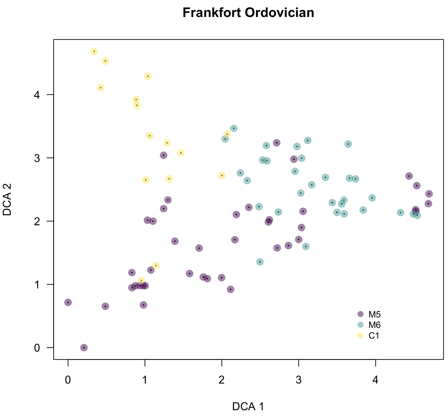
As mentioned, codedScoresPlot() can also be called on sample scores. Here, I code the points by depositional sequence, and it becomes clear that the triangular shape is a real structure caused by a change in species composition over time.
codedScoresPlot(dcaSampleScores, samplePropsCulled, property="sequence", overlayNames=FALSE, ordinationType="DCA", main="Frankfort Ordovician", legendPos=c(3.7, 0.7), cex.text=0.8)
Custom color-coded plots of scores
It is also possible to have much greater control over how points are shown on these coded plots, including controlling the size, symbol, and size of the points, as well as the order of the values in the legend. It only requires a little set-up (not much) to make a data frame with all the details.
The data frame will have five columns with these names: value, which corresponds to all the values of the property that will be used to code the data, pch for the symbol type, color for the symbol color, cex for the symbol size, and label for text to be shown in the legend. There will be as many rows as there are values for the property.
The easiest way to get started is to find the values for the property. For this example, I'd like to code sample scores by the higherTaxon property in the sample properties, so the first step is to see all the values:
unique(taxonProps$higherTaxon)
Make a vector called value with these in the order that you want them to appear in the legend. Next, make a vector pch of the same length with the plotting symbols corresponding to each of these groups. Do the same for color and cex. Colors can be named colors, colors from a function like gray() or rgb(), or even hex codes as used in web development. Last, make a vector called label, which might have the same values as those in value if you like those names. Join these five vectors into a data frame, then delete these vectors.
value <- c("Bryozoa", "Inarticulata", "Strophomenata", "Rhynchonellata", "Bivalvia", "Gastropoda", "Trilobita", "other")
pch <- c(16, 16, 16, 16, 16, 16, 16, 17)
color <- c("chartreuse3", "cadetblue1", "deepskyblue1", "dodgerblue", "gold", "goldenrod", "darkorchid2", "cornsilk3")
cex <- c(1.7, 1.7, 1.7, 1.7, 1.7, 1.7, 1.7, 1.3)
label <- value
customHigherTaxa <- data.frame(value, pch, color, cex, label)
rm(value, pch, color, cex, label)
Using these custom values in your plot is easy; just assign them to the customPoints argument:
codedScoresPlot(dcaSpeciesScores, taxonPropsCulled, property="higherTaxon", customPoints=customHigherTaxa, overlayNames=TRUE, ordinationType="DCA", legendPos=c(3.7, 0.7), cex.text=0.8)
customPointsCulled <- cullCustomPoints(customHigherTaxa, taxonPropsCulled, "higherTaxon")
This can be done for sample scores in the same way, and it’s a great way to generate figures ready for publication or nearly so. Where it is especially useful is when you have several data sets that you want to plot in the same way: custom plots ensure that the plot symbols follow the same convention. Ensure that the values of value in the custom-plot data frame encompass all the values of the property in all the data sets. If they don't, some points will not be plotted. Similarly, if a particular data set has only some of the values of the property, run cullCustomPoints() to remove the missing values; otherwise, they will be displayed in the legend but won’t appear in the plot. This is done like this:
customPointsCulled <- cullCustomPoints(customHigherTaxa, taxonPropsCulled, "higherTaxon")
codedScoresPlot(dcaSpeciesScores, taxonPropsCulled, property="higherTaxon", customPoints=customPointsCulled, overlayNames=TRUE, ordinationType="DCA", main="Frankfort Ordovician", legendPos=c(3.7, 0.7), cex.text=0.8)
Additional functions
ordinationUtilities.R has three other functions that ease working with ecological data sets.
asPresenceAbsence() makes it easy to convert from a counts matrix to a presence/absence data frame, so that all values are 1 (taxon is present in a sample) or 0 (taxon is absent). Call it like this:
counts.pa <- asPresenceAbsence(counts)
sampleComposition() displays the composition of individual samples by removing all the species that do not occur in the sample. By default, the results are displayed in order of decreasing abundance, letting you quickly assess which taxa are most common. By setting sorted=FALSE, taxa are displayed in the same order of their columns in the counts data frame. Samples can be selected using rowName or rowNumber, but not both. Here are a couple examples of how to call sampleComposition():
sampleComposition(counts, rowName=="00-FN-18.8")
sampleComposition(counts, rowNumber=8, sorted=FALSE)
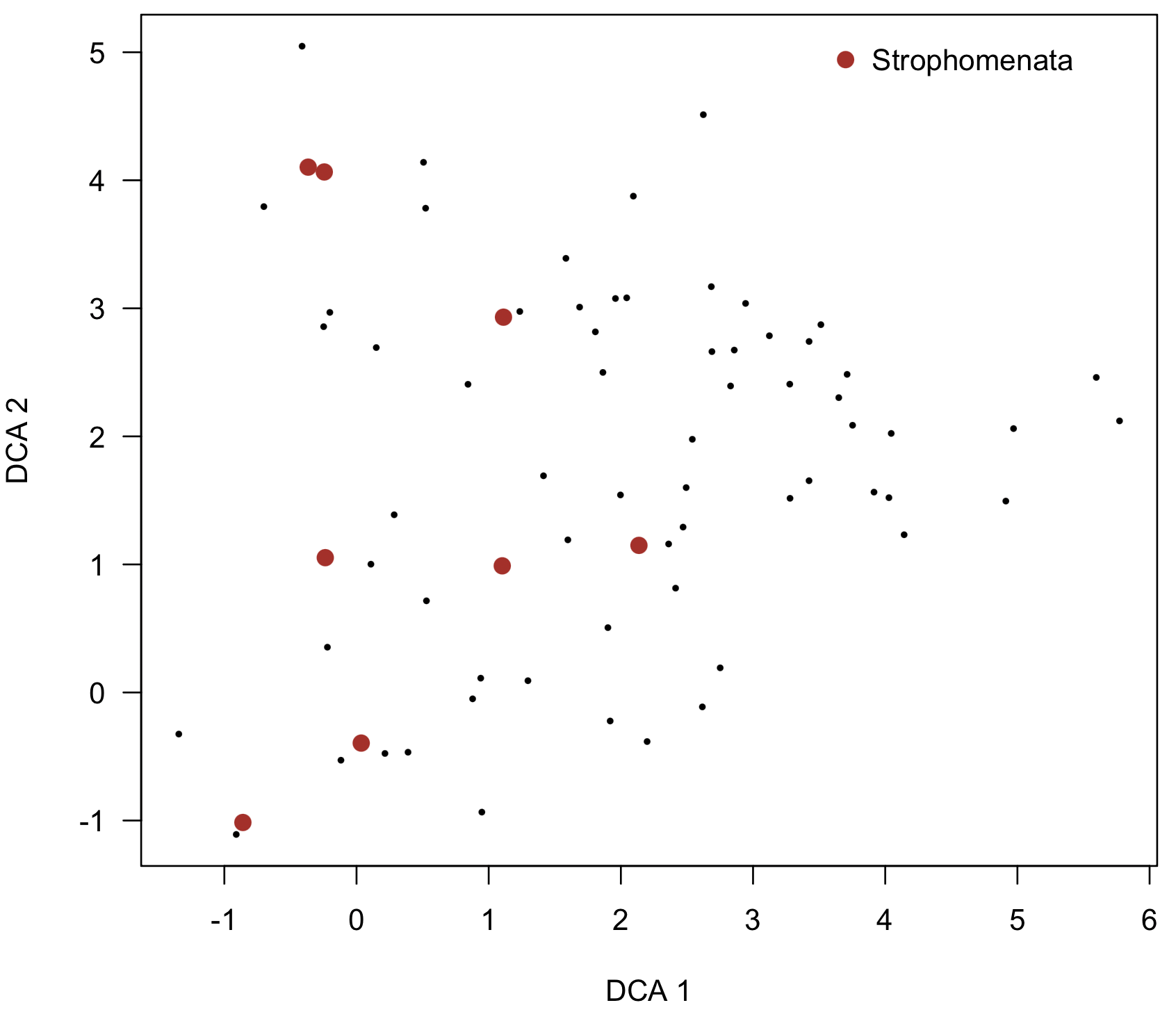
highlightOrdinationPlot() is similar to codedScoresPlot(), except that only particular points will be highlighted, such as all taxa that are trilobites. In other words, all points will be displayed, but only certain ones will be highlighted. Specify the property (the column name in the properties data frame) and the value in it that you wish to match, such as "Trilobita" in the "class" property. Control how the points look with color, pch, and cex.
highlightOrdinationPlot(dcaSpeciesScores, taxonPropsCulled, property="class", value="Strophomenata", ordinationType="DCA", legendPos=c(3.5, 5.2), color="firebrick", pch=16, cex=1.3)
References
Holland, S.M., and M.E. Patzkowsky. 2004. Ecosystem structure and stability: middle Upper Ordovician of central Kentucky, USA. Palaios 19:316–331.
Patzkowsky, M.E., and S.M. Holland. 2012. Stratigraphic Paleobiology. Chicago, University of Chicago Press.
