Regression diagnostic plots
19 October 2011
After you perform a regression, calling plot() or plot.lm() on that regression object brings up four diagnostic plots that help you evaluate the assumptions of the regression. How to interpret these plots is best shown by comparing a regression in which the assumption are met with those in which the assumptions are violated. Recall that a least-squares regression assumes that the errors (residuals) are normally distributed, that they are centered on the regression line, that their variance doesn't change as a function of x.
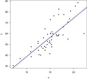
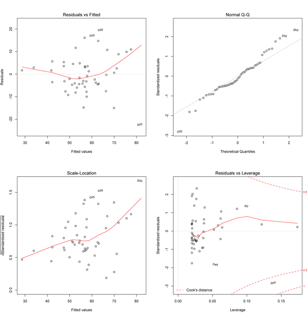
Case 1: A good regression
First, let’s start with a good regression, one in which all of the assumptions of the regression are met. Here’s the data with the regression line, fitted with least squares.
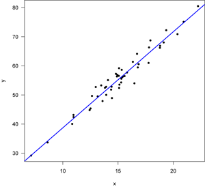
Note that the points lie around the line along the total length of the line, that the amount of variation around the line doesn't change along the length of the line, and that there are no outliers (single points that lie far from the line). The points are also symmetrically scattered about the line, as you would expect if the errors were normally distributed. The four diagnostic plots from plot.lm() look like this:
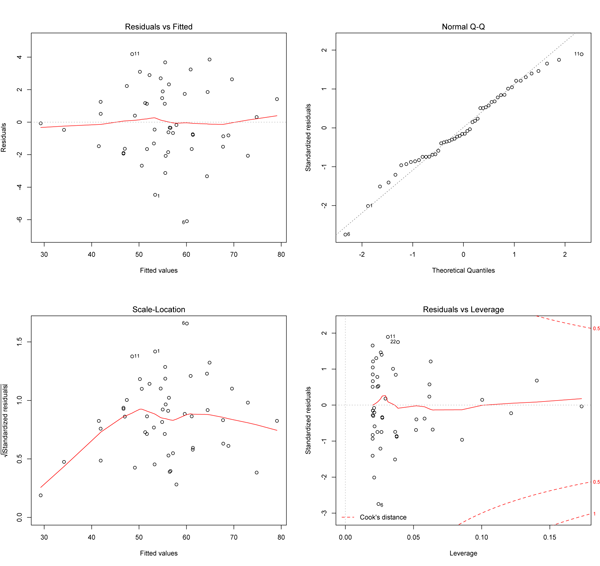
The upper left plot shows the residuals (the vertical distance from a point to the regression line) versus the fitted values (the y-value on the line corresponding to each x-value; this is also called y-hat). If there was no scatter, if all the points fell exactly on the line, then all of the dots on this plot would lie on the gray horizontal dashed line. The red line is a smoothed curve that passes through the actual residuals and it is relatively flat here and lies close to the gray dashed line; this is what you hope to see. Note that several points are numbered, and these are points to pay special attention to. Some points are always numbered, so seeing numbered points does not necessarily indicate a problem. You can easily identify these points in your plot because the order of the points along fitted values matches the order along the x-axis in the original plot. Here, the two numbered points near the bottom correspond to the two points near the center of the data plot that lie farthest below the line; one is at an x of about 17, and the other has an x-coordinate barely less than 15.
The upper right plot is a qqnorm() plot of the residuals. Recall that one of the assumptions of a least-squares regression is that the errors are normally distributed. This plot evaluates that assumption. Here, note that the points lie pretty close to the dashed line. If the errors (residuals) were precisely normally distributed, they would lie exactly on this line. Some deviation is to be expected, particularly near the ends (note the upper left), but the deviations should be small, as they are here.
The x-axis on the lower left plot is identical to the upper left plot: it is the fitted values. The y-axis is the square root of the standardized residuals, which are residuals rescaled so that they have a mean of zero and a variance of one; note that all values are positive. This plot eliminates the sign on the residual, with large residuals (both positive and negative) plotting at the top and small residuals plotting at the bottom. Here, note that all of the numbered points (which will be the same in all plots) plot at the top here; two of these plotted low on the upper left plot because they had large but negative residuals (they plot below the regression line). The red line here shows the trend. The regression assumes homoscedasticity, that the variance in the residuals doesn’t change as a function of x. If that assumption is correct, the red line should be relatively flat. It is here, except at the far left end, where one or two data points pull it down.
The lower right plot shows the standardized residuals against leverage. Note that the standardized residuals are centered around zero and reach 2–3 standard deviations away from zero, and symmetrically so about zero, as would be expected for a normal distribution. Leverage is a measure of how much each data point influences the regression. Because the regression must pass through the centroid, points that lie far from the centroid have greater leverage, and their leverage increases if there are fewer points nearby. As a result, leverage reflects both the distance from the centroid and the isolation of a point. The plot also contours values of Cook’s distance, which measures how much the regression would change if a point was deleted. Cook’s distance is increased by leverage and by large residuals: a point far from the centroid with a large residual can severely distort the regression. On this plot, you want to see that the red smoothed line stays close to the horizontal gray dashed line and that no points have a large Cook’s distance (i.e, >0.5). Both are true here.
In this first example, all of the assumptions of the regression appear to be upheld. Now let’s examine cases in which the assumptions are violated.
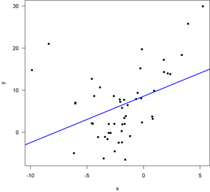
Case 2: A non-linear relationship
Here, a linear regression has been fitted to a parabola, visible as a U-shaped distribution of points. This violates the assumptions of the regression, mostly in that the errors are not centered around the regression line: the points lie above the line at both small and large values of x, but lie mostly below the line at intermediate values of x. Let’s see what the diagnostic plots look like.
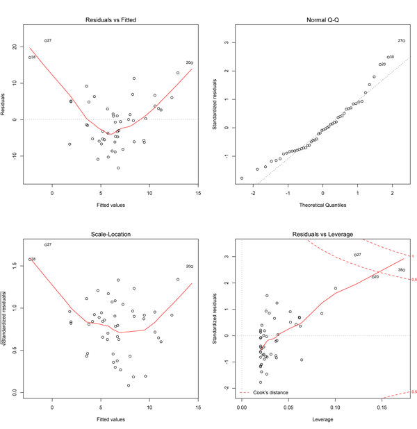
The upper left plot is the most useful here, as it will detect whether the residuals are centered around the line. As expected the smoothed red curve shows a distinct U-shape, indicating that a linear model is not a good fit to these data. The other plots also show problems, including a curved pattern on the qqnorm plot (upper right), a systematic trend in the variance of residuals (lower left), and several points with large Cook’s distances (lower left). Such a regression should not be used as multiple assumptions are violated. In this case, a different function (a parabola) should be fitted.
Case 3: Variance changes with x
In this example, the variance increases with x: note the larger spread around the regression line at the right than to the left. This is common in the natural sciences and it often occurs when the data are log normally distributed.
The most useful plot here is in the lower left, as it shows that the variation increases with increasing values of x (remember that fitted values will reflect position along the x-axis). Point 20 (the one far below the line at the far right of the data plot) is flagged as having a large Cook’s distance (lower right plot) and it has an unusually small residual (upper right plot). The residuals may be non-normal (upper right) and there might be a trend in residuals along the fitted line (upper left), but the curvature of the red line is driven by just a few points. The real problem here is revealed by the lower left plot that shows the errors are heteroscedastic. A data transformation (e.g., log transformation) should be tried to see if fixes this problem.
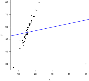
Case 4: Outliers
In this last case, a good linear relationship is compromised by a single outlier. This is an extreme case, but the data show a strong and tight positive linear relationship with the exception of a single point. This point radically influences the slope on the regression, and we’d expect this to show up as a large Cook’s distance.
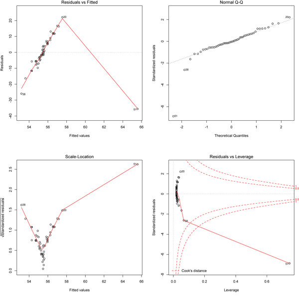
As expected, the lower right plot shows that data point 51 has an exceptionally large Cook's distance. This outlier also affects the other diagnostics. By changing the slope, this outlier causes a systematic trend in the residuals (upper left plot) and in the size of the residuals (lower left plot). The outlier shows up as a -7 sigma observation on the qqnorm plot.
Summary
Overall, the four plots can be used to diagnose specific problems. The upper left plot shows whether the wrong model was fitted (e.g., a line versus a parabola). The upper right plot shows whether the residuals are normally distributed. The lower left plot shows whether the data are homoscedastic. The lower right plot shows whether there are influential outliers.
Code
# Good linear relationship x <- rnorm(50, mean=15, sd=3) slope <- 3.2 intercept <- 7.5 errors <- rnorm(50, sd=2) y <- slope * x + intercept + errors reg <- lm(y~x) dev.new() plot(x,y,pch=16, las=1) abline(reg, lwd=2, col="blue") dev.new() par(mfrow=c(2,2)) plot.lm(reg) # Parabola x <- rnorm(50, mean=-2, sd=3) quadratic <- 0.5 slope <- 3.2 intercept <- 7.5 errors <- rnorm(50, sd=5) y <- quadratic*x*x + slope*x + intercept + errors reg <- lm(y~x) dev.new() plot(x,y,pch=16, las=1) abline(reg, lwd=2, col="blue") dev.new() par(mfrow=c(2,2)) plot.lm(reg) # Increasing variance x <- rnorm(50, mean=15, sd=3) slope <- 3.2 intercept <- 7.5 errors <- rnorm(50,sd=2) y <- slope * x + intercept + errors*((x-min(x))/2) reg <- lm(y~x) dev.new() plot(x,y,pch=16, las=1) abline(reg, lwd=2, col="blue") dev.new() par(mfrow=c(2,2)) plot.lm(reg) # Outlier x <- rnorm(50, mean=15, sd=3) slope &- 3.2 intercept &- 7.5 y <- slope * x + intercept + errors # good line x <- c(x,50) # adding an outlier y <- c(y,30) reg <- lm(y~x) dev.new() plot(x,y,pch=16, las=1) abline(reg, lwd=2, col="blue") dev.new() par(mfrow=c(2,2)) plot.lm(reg)
